Combining ROC Curves with Indifference Curves to Measure an ML Model's Utility
For the below examples, assume we have a binary classification task where the class label is $y \in {0, 1}$, and the model’s predictions are $\hat{y} \in {0, 1}$
ROC Curves
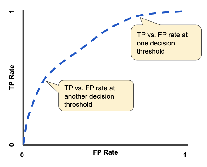
Given the true positive rate ($TPR$) and false positive rate ($FPR$) of our model at all possible thresholds, we can plot an ROC curve.
The x-axis is the $TPR$ of our model at a specific decision threshold, while the y-axis is the $FPR$ of our model at that corresponding $TPR$.
Each point along the ROC curve represents the $(TPR, FPR)$ rate at a specific model decision threshold. An example ROC curve is shown using the blue dotted line below..
We can integrate the area under the curve (AUC) to calculate the area under the receiver operating characteristic (AUROC). This is the shaded region below.
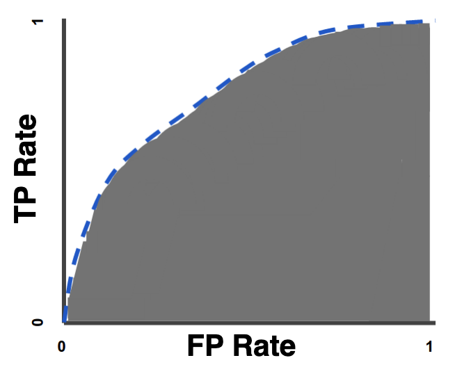
AUROC is a dimensionless scalar that succinctly summarizes the performance of your model.
The interpretation is as follows: The AUROC is equal to the probability that if you randomly chose a positive and negative example from your dataset, the model’s prediction for the positive example would be higher than its prediction for the negative example.
In other words, $AUROC = P(\hat{y_i} > \hat{y_j} \mid y_i = 1, y_j = 0)$
A perfect classifier has $AUROC = 1$.
A random classifier has $AUROC = 0.5$
This is also referred to as the $c$-statistic
This is illustrated in the diagram below.
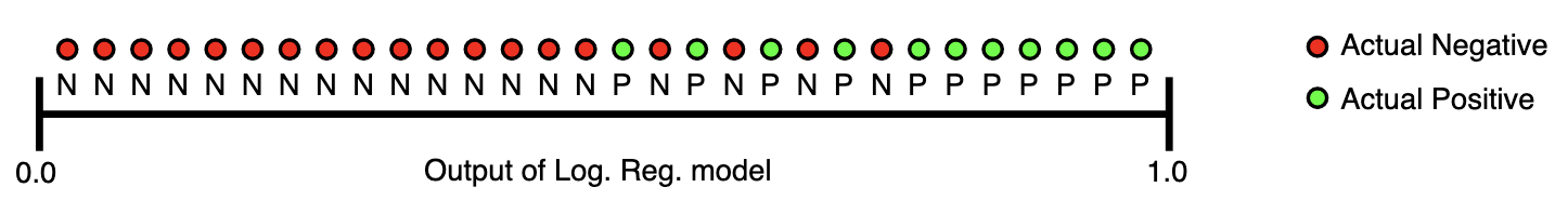
The AUROC for this logistic regression model is the probability that a random green dot is located to the right – i.e. has a higher $\hat{y}$ assigned by the model – of a random red dot.
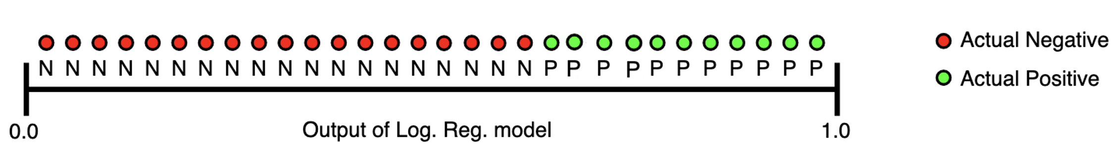
If the logistic regression had a perfect $AUROC = 1$, then the diagram would look like the following:
NOTE: Images from this section were taken from the Google ML Docs
Limitations of ROC Curves
AUROC is a measure of our model’s predictive performance, and succinctly captures the trade-off between true and false positives.
However, it has several limitations that can make it highly misleading in practice:
- It ignores utility, i.e. the cost of different types of errors. In real life, however, a false negative (i.e. missing a cancer diagnosis) can be 100x worse than a false positive.
- It ignores prevalence, i.e. how frequent the minority class occurs. If you want your classifier to be able to predict the minority class, the AUROC can be misleading as it is independent of class prevalence.
- It ignores calibration, i.e. the actual predicted probability for each data point. AUROC only considers the relative ordering of predictions, not their absolute values, and thus it can’t tell you how well-calibrated your model is.
- It ignores work capacity, i.e. the number of true/false positives that you are able to actually able to take action on in the real-world. Consider a cancer screening facility with a limited number of nurses. Rather than screen every patient flagged by the model, the nurses will only be able to screen the top-$k$ patients with the highest predicted risks of cancer. By definition, these top highly ranked patients will occur towards the left-side of the ROC curve. Thus, the real-world usage of the model is essentially limited to only areas of the curve where $FPR < C$ for some constant $C$ which is limited by the work capacity of the nursing staff. However, the majority of the AUROC’s value comes from integrating the ROC curve in regions of high $FPR$. Thus, the AUROC will be optimistically biased by these high $FPR$ regions which, in practice, will never even occur.
This post will focus on the first issue of utility.
ROC Curves + Utility
Motivation
Our primary goal is to choose the model which achieves the highest utility.
The utility $U$ is defined as the total benefit achieved from deploying a model.
Note that this is different from the accuracy / precision / AUROC of a model. These metrics measure model performance, but do not measure the actual benefit of using the model in practice.
That’s because these metrics ignore the fact that false positives/negatives may have different costs associated with them.
Consider the following examples…
- You run a hospital that screens patients for cancer. Here, a false negative (i.e. missing a cancer diagnosis) is much worse than a false positive (i.e. subjecting a patient to a different test).
- You are building a spam filter for email. Here, a false positive (i.e. causing a valid email to be deleted as spam) is much worse than a false negative (i.e. causing a spam email to appear in the user’s inbox)
Thus, what we really want is not the model with the highest AUROC, but rather the model that has the maximum expected utility $E[U]$ of using it.
Measuring Utility with Indifference Curves
We will use a tool from economics called indifference curves to help use choose the most useful model.
An indifference curve contains the set of all models which yield the same utility – in other words, we should be “indifferent” to choosing any model that lies within the same indifference curve.
Thus, an indifference curve in ROC space will simply be a set of points $(TPR, FPR)$ where any model that falls along that line will yield identical utilities.
Ideally, we’ll choose a model that sits on the indifference curve that achieves $\max{ E[U] }$.
Notation
We assume we know the following from our ROC Curve analysis:
- The proportion of positive / negative examples in our dataset.
- Let $R_p = P(y = 1)$ be the proportion of positive examples in our dataset (aka “prevalence”)
- Let $R_n = P(y = 0)$ be the proportion of negative examples in our dataset
- The probability of the model predicting a true/false positive/negative
- Let $P(TP) = P(\hat{y} = 1, y = 1)$ be the probability of a true positive
- Let $P(FP) = P(\hat{y} = 1, y = 0)$ be the probability of a false positive
- Let $P(TN) = P(\hat{y} = 0, y = 0)$ be the probability of true negative
- Let $P(FN) = P(\hat{y} = 0, y = 1)$ be the probability of false negative
- The true/false positive rate of our model
- Let $TPR = P(\hat{y} = 1\mid y = 1)$ and $FPR = P(\hat{y} = 1 \mid y = 0)$
Note that the following hold:
\[\begin{aligned} P(TP) &= P(\hat{y} = 1, y = 1) = P(y = 1) P(\hat{y} = 1 \mid y = 1) = R_p (TPR)\\ P(FP) &= P(\hat{y} = 1, y = 0) = P(y = 0) P(\hat{y} = 1 \mid y = 0) = R_n (FPR)\\ P(FN) &= P(\hat{y} = 0, y = 1) = P(y = 1) P(\hat{y} = 0 \mid y = 1) = R_p (1 - TPR)\\ P(TN) &= P(\hat{y} = 0, y = 0) = P(y = 0) P(\hat{y} = 0 \mid y = 0) = R_n (1 - FPR) \end{aligned}\]We will also introduce a new set of variables for our utility $U$:
- Let $U$ be the utility of a model prediction
- Let $U_{TP}$ be the utility of a true positive
- Let $U_{FP}$ be the utility of a false positive
- Let $U_{TN}$ be the utility of a true negative
- Let $U_{FN}$ be the utility of a false negative
Formula for $E[U]$
By conditional expectation, we have that:
\[\begin{aligned} E[U] &= E[U \mid TP] P(TP) + E[U \mid FN] P(FN) + E[U \mid FP] P(FP) + E[U \mid TN] P(TN) \end{aligned}\]which we can rewrite as…
\[\begin{aligned} E[U] &= U_{TP} R_p (TPR) + U_{FN} R_p (1 - TPR) + U_{FP} R_n (FPR) + U_{TN} R_n (1 - FPR) \end{aligned}\]Note that this creates a 3-dimensional plane in ROC space where holding $E[U]$ constant yields a line in ROC space.
Sanity Checks
Let’s do a few sanity checks.
At TPR = 1, FPR = 1 (i.e. predict everything is positive)…
\[E[U] = U_{TP} R_p + U_{FP} R_n = (U_{TP} - U_{FP}) R_p + U_{FP}\]- If every example is negative ($R_p = 0$), then the model will incorrectly label everything as positive. Thus, the expected utility of a model prediction is $U_{FP}$
- If every example is positive ($R_p = 1$), then the model will correctly label everything as positive Thus, the expected utility of a model prediction is $U_{TP}$
- As $R_p$ increases, then we expect to derive more utility from the $(U_{TP} - U_{FP})$ term as there are more positive examples in our dataset that our model will predict correctly. We get positive utility only if the benefit of true positives is greater than the cost of false positives. Otherwise, this term will be negative and will decrease our expected utility.
At TPR = 0, FPR = 0 (i.e. predict everything is negative)…
\[E[U] = U_{FN} R_p + U_{TN} R_n = (U_{FN} - U_{TN}) R_p + U_{TN}\]- If every example is negative ($R_p = 0$), then the model will correctly label everything as negative. Thus, the expected utility of a model prediction is $U_{TN}$
- If every example is positive ($R_p = 1$), then the model will incorrectly label everything as negative. Thus, the expected utility of a model prediction is $U_{FN}$
At TPR = 1, FPR = 0 (i.e. perfect classifier)…
\[E[U] = U_{TP} R_p + U_{TN} R_n\]- If we perfectly classify everything, then we get the benefit of utilities for correct decisions (i.e. TP and FN)
Solving the Equation for Indifference Curves
Now, we can solve for the equation for the indifference curves of our model / chosen utilities.
By definition, an indifference curve is simply the set of points in our ROC space which have the same expected utility. Thus, we can solve for some fixed $E[U]$:
\[\begin{aligned} E[U] &= U_{TP} R_p (TPR) + U_{FN} R_p (1 - TPR) + U_{FP} R_n (FPR) + U_{TN} R_n (1 - FPR)\\ TPR (U_{TP}R_p - U_{FN} R_p) &= E[U] - U_{FN}R_p - U_{FP}R_n (FPR) + U_{TN}R_n (FPR) - U_{TN}R_n\\ TPR &= \frac{E[U] - U_{FN}R_p - U_{TN}R_n}{U_{TP}R_p - U_{FN} R_p} - \frac{U_{FP}R_n + U_{TN}R_n}{U_{TP}R_p - U_{FN} R_p} (FPR)\\ TPR &= \frac{E[U] - U_{FN}R_p - U_{TN}R_n}{R_p(U_{TP} - U_{FN})} + \frac{R_n(U_{TN} - U_{FP})}{R_p(U_{TP} - U_{FN})} (FPR)\\ \end{aligned}\]Note that the slope $s$ is constant across all indifference curves (i.e. doesn’t depend on $E[U]$), and is given by:
\[s = \frac{R_n(U_{TN} - U_{FP})}{R_p(U_{TP} - U_{FN})}\]Where $U_{TP} - U_{FN}$ is the value of making a correct decision when the example is positive, while $U_{TN} - U_{FP}$ is the value of making a correct decision when the example is negative.
We assume $s > 0$, otherwise making incorrect predictions would have more utility than making correct predictions.
Choosing the Optimal Model
Interpretation 1: Slope of ROC Curve
Going back to our primary goal, we want to choose the model with the maximum expected utility, i.e. $\max { E[U] }$.
Since the function for expected utility is concave, we can determine its maximum by taking the derivative and setting it equal to 0:
\[\begin{aligned} \frac{\delta E[U]}{\delta FPR} &= U_{TP} R_p \frac{\delta TPR}{\delta FPR} - U_{FN} R_p \frac{\delta TPR}{\delta FPR} + U_{FP} R_n - U_{TN} R_n = 0\\ \frac{\delta TPR}{\delta FPR} &= \frac{U_{FP} R_n - U_{TN} R_n}{ U_{FN}R_p - U_{TP} R_p}\\ \frac{\delta TPR}{\delta FPR} &= \frac{R_n(U_{TN} - U_{FP})}{R_p(U_{TP} - U_{FN})}\\ \frac{\delta TPR}{\delta FPR} &= s \end{aligned}\]By definition, the slope of the tangent line of the ROC curve is $\frac{\delta TPR}{\delta FPR}$
We also previously derived that the slope of each indifference curve is $s = \frac{R_n(U_{TN} - U_{FP})}{R_p(U_{TP} - U_{FN})}$.
Thus, we have that the maximum value of $E[U]$ is achieved when the slope of the ROC curve ($\frac{\delta TPR}{\delta FPR}$) is equivalent to the slope of the indifference curve ($s$).
In other words, the most useful model lies on the point of the ROC curve whose tangent line has a slope equivalent to $s = \frac{R_n(U_{TN} - U_{FP})}{R_p(U_{TP} - U_{FN})}$.
Interpretation 2: Likelihood ratio of optimal threshold
Next, we aim to show the link between the likelihood ratio $l(x)$ and $\max { E[U] }$
By definition, the likelihood ratio $l(x)$ for some value $x$ output by our model is defined as
\[l(x)= \frac{P(\hat{y} = x \mid y = 1)}{P(\hat{y} = x \mid y = 0)}\]Let $f(x)$ be the probability density function produced by our model when making predictions for data points where $y = 1$.
Let $g(x)$ be the probability density function produced by our model when making predictions for data points where $y = 0$.
In other words, given an example where $y = 1$, the distribution of predictions $\hat{y}$ made by our model is given by $f(x)$.
Note that the following thus holds:
\[l(x)= \frac{P(\hat{y} = x \mid y = 1)}{P(\hat{y} = x \mid y = 0)} = \frac{f(x)}{g(x)}\]Let us choose some threshold $t$ such that any model predictions $>t$ are set to $\hat{y} = 1$, while any predictions $\le t$ are set to $\hat{y} = 0$
Let $TPR(t)$ be the true positive rate using threshold $t$, and $FPR(t)$ be the false positive rate using threshold $t$
This can be interpreted graphically as follows: $(TPR(t), FPR(t))$ is the point on the ROC curve which corresponds to the model attained by using the decision threshold of $t$.
Then the following equations must hold:
\[\begin{aligned} TPR(t) &= P(\hat{y} = 1 \mid y = 1) = \int_{t}^{\infty} f(x) dx\\ FPR(t) &= P(\hat{y} = 0 \mid y = 1) = 1 - P(\hat{y} = 0 \mid y = 0) = 1 - \int_{-\infty}^{t} g(x) dx \end{aligned}\]The diagram below visualizing these integrals.
$TPR(t)$ is calculated by integrating all of the area of $f(x)$ to the right of the threshold cutoff (labeled $t$), as that region corresponds to correct positive predictions (i.e. $\hat{y} > 1 \wedge y = 1$).
$FPR(t)$ is all of the negation of the sum of the area of $g(x)$ to the left of the threshold $t$, since $g(x)$ represents the true negative rate $TNR(t)$ (which is $1 - FPR(t)$).
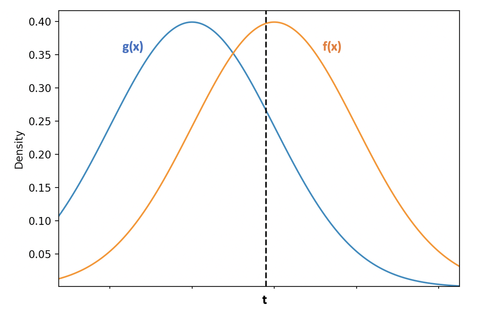
Now, we take the derivative of $TPR(t)$ and $FPR(t)$ with respect to $t$:
\[\begin{aligned} \frac{\delta TPR(t)}{\delta t} &= \frac{\delta }{\delta t}\int_{t}^{\infty} f(x) dx = -f(t)\\ \frac{\delta FPR(t)}{\delta t} &= \frac{\delta }{\delta t} 1 - \int_{-\infty}^{t} g(x) dx = - g(t) \end{aligned}\]Canceling out $\delta t$ leaves us with…
\[\begin{aligned} \frac{\delta TPR(t)}{\delta FPR(t)} &= \frac{\frac{\delta TPR(t)}{\delta t}}{\frac{\delta FPR(t)}{\delta t}}\\ &= \frac{-f(t)}{-g(t)}\\ &= \frac{f(t)}{g(t)} \end{aligned}\]Going back to our formula for likelihood, we thus have that:
\[l(t) = \frac{f(t)}{g(t)} = \frac{\delta TPR(t)}{\delta FPR(t)}\]Thus, the slope of the ROC curve at the point $(TPR(t), FPR(t))$ is equal to the likelihood ratio for the model outputting a value of $t$.
Previously, we found that when $\frac{\delta TPR}{\delta FPR} = s$, then we’ve achieved our optimal utility.
Thus, the optimal threshold $t*$ is achieved when the following holds:
\[l(t*) = s = \frac{R_n(U_{TN} - U_{FP})}{R_p(U_{TP} - U_{FN})}\]Suboptimal Alternatives
In contrast to the formulas derived above for finding the optimal model from a utility standpoint, there are two common heuristics that I’ll briefly mention as suboptimal alternatives:
- Youden index ($J$)
- This is defined as the point on the ROC curve that is vertically farthest from the random chance line
- The objective that it maximizes is: $TPR - (1 - FPR)$
- Closest point on ROC curve to (0,1) ($K$)
Why are they suboptimal? They ignore the utility matrix as well as the prevalence of the positive class. They are only optimal when $l(x_c) = 1$.
Example (taken from here)
Assume that the prevalence of cancer is 0.4.
Case 1) If it’s 2x more valuable to make a correct decision when cancer is present than when cancer is absent, then our optimal decision threshold is the cross above the number 6 in the below chart.
This is because $l(x_c) = \frac{0.6 * 1}{0.4 *2} = 0.75$, which corresponds to $ln(0.75) = -0.29$ in the actual distribution of data shown in the inset.
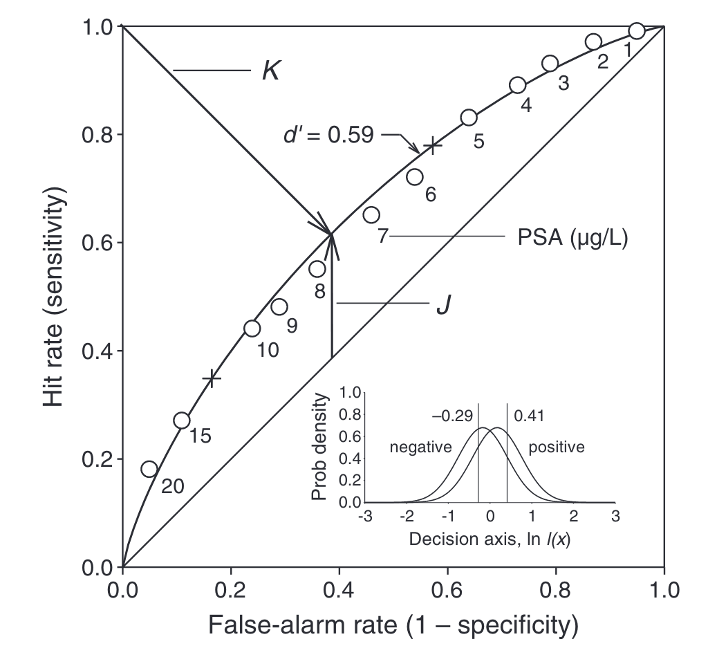
Case 2) If it’s equally important to make correct decisions both when patients have/do not have cancer, then our optimal decision threshold is the cross near the number 15 in the above chart.
This is because $l(x_c) = \frac{0.6 * 1}{0.4 *1} = 1.5$, which corresponds to $ln(1.5) =0.41$ in the actual distribution of data shown in the inset.
Note that the Youden index ($J$) and the most-upper-left heuristic ($K$) are suboptimal in both cases, as neither points to the correct threshold.
Graphical Interpretation
In the below plots (taken from this great article), the red line represents the trivial baseline of predicting everything is negative, while the blue line represents the trivial baseline of predicting that everything is positive.
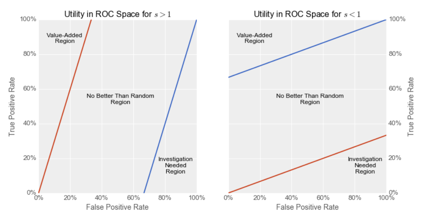
The Value-Added Region represents the area where your ROC curve must intersect in order for your model to be more useful in practice than a trivial baseline of predicting everything is positive or negative. It is always in the upper-left of our ROC plot.
Because $s > 0$, the value for $E[U]$ always increases as you go towards the upper-left of ROC space in proportion to $s$, as we’re increasing our $TPR$ while decreasing our $FPR$ (weighted by their relative costs).
Thus, for our model to have any utility, it’s $(FPR, TPR)$ needs to fall within the Value-Added Region region, i.e. to the upper-left of the aforementioned baseline models (i.e. above both the red and blue lines).
Note that the farther that $s$ is from 1, the smaller the Value-Added Region, thus the harder it is to build a model with real-world utility.
Left Plot: The slope $s$ of the indifference curve is $> 1$. This means that either (i) there are many more negatives than positives in our dataset, (ii) the value of making a correct decision when the example is negative is much greater than the value of correctly classifying positive examples, or (iii) both (i) and (ii) are true. Because of this, the red line, representing the model that predicts everything is negative, achieves a much higher utility than the blue line. In order for our model to outperform this negative baseline, its ROC curve needs to go through the “Value-Added Region”.
Right Plot: The slope $s$ of the indifference curve is $< 1$. This means that either (i) there are many more positives than negatives in our dataset, (ii) the value of making a correct decision when the example is positive is much greater than the value of correctly classifying negative examples, or (iii) both (i) and (ii) are true. Because of this, the blue line, representing the model that predicts everything is positive, achieves a much higher utility than the red line. In order for our model to outperform this positive baseline, its ROC curve needs to go through the Value-Added Region.
References
These blogs/articles were extremely helpful in putting together this post, and I recommend you check them out as a great resource on the topic:
- http://nicolas.kruchten.com/content/2016/01/ml-meets-economics/
- https://developers.google.com/machine-learning/crash-course/classification/roc-and-auc
- Irwin, R. John, and Timothy C. Irwin. “A Principled Approach to Setting Optimal Diagnostic Thresholds: Where ROC and Indifference Curves Meet.” European Journal of Internal Medicine 22, no. 3 (June 2011): 230–34. https://doi.org/10.1016/j.ejim.2010.12.012.
- Habibzadeh, Farrokh, and Parham Habibzadeh. “The Likelihood Ratio and Its Graphical Representation.” Biochemia Medica 29, no. 2 (June 15, 2019): 193–99. https://doi.org/10.11613/BM.2019.020101.
- Choi, B. C. K. “Slopes of a Receiver Operating Characteristic Curve and Likelihood Ratios for a Diagnostic Test.” American Journal of Epidemiology 148, no. 11 (December 1, 1998): 1127–32. https://doi.org/10.1093/oxfordjournals.aje.a009592.