Plotting the Distribution of MLB Batting Statistics Over Time
What is a "good" batting average? An "average" OBP? An "elite" SLG?
Most people know that a batting average over .300 is the mark of a great hitter, and that hitting .200 will land you on the bench.
But about all the batting averages in between?
Is a player who bats .265 a “good” hitter? What about .280?
As hard as it is to keep a running benchmark of batting averages in your head, what about all the other less popular (but equally if not more important) baseball stats?
Is an OBP of .360 the mark of a below average or above average player?
What about a SLG of .450?
Adding one more wrinkle to this challenge, any sufficiently accurate benchmark of baseball stats must take time into account, as MLB’s offensive environment is perpetually changing with every season.
If you hit 40 HRs in 2021, you would have finished right behind Fernando Tatis for an MVP-worthy 6th overall in the league, which is quite the impressive achievement. But in 2000, during the height of the Steroid Era? You would be tied with Ken Griffey Jr., who finished a respectable (but not quite MVP-worthy) 16th overall.
What if you could bat .315 over the course of a full season? Well, if that season were 2021 then you’d be a bonafide All-Star and have the 3rd highest batting average in the entire league, right ahead of Juan Soto.
What if you batted .315 in 1931, when the league-wide average was .296? You’d be Yankees OF Ben Chapman, who had only the 5th best batting average on his own team that year!
To gain a better reference point for these common statistics, I set out to create a set of benchmarks for each stat for every year since 1901.
I only considered offensive stats for this analysis, but might consider pitching stats in the future.
After downloading a SQLite version of the Lahman Baseball Database through the BoxBall Github repo, I calculated percentile scores for each of the following statistics (using only players with >400 plate appearances each season):
- AVG
- OBP
- SLG
- OPS
- Walks
- Singles
- Doubles
- Triples
- Home Runs
- Strike outs
- Stolen bases
- Plate appearances
- At bats
To create a simple set of reference points for each statistic, I used the following player archetypes:
- Terrible = 0th percentile (aka “Min”) of a given stat during a given season
- Mediocre = 25th percentile
- Median = 50th percentile
- Good = 75th percentile
- Elite = 95th percentile
- Best = 100th percentile (aka “Max”)
As an example, if there are 100 players in the league and the distribution of walks was uniformly distributed without replacement from 1-100, then I’d consider 50 walks to be a Median achievement, 75 walks to be Good, and 95 walks to be Elite.
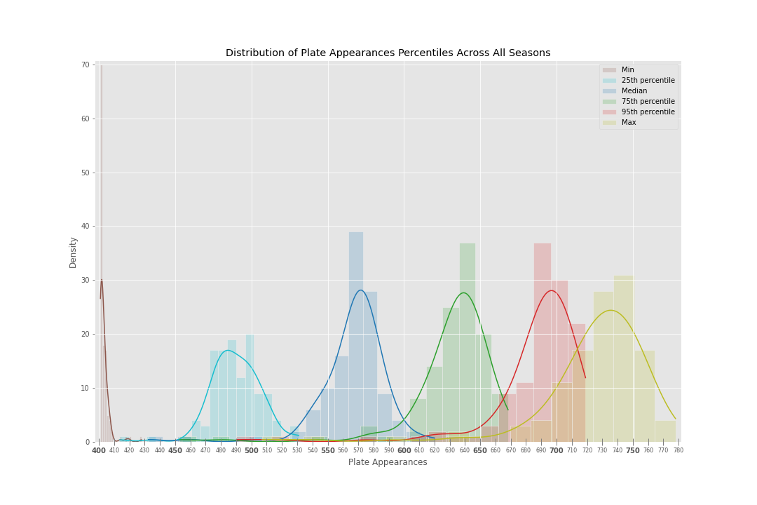
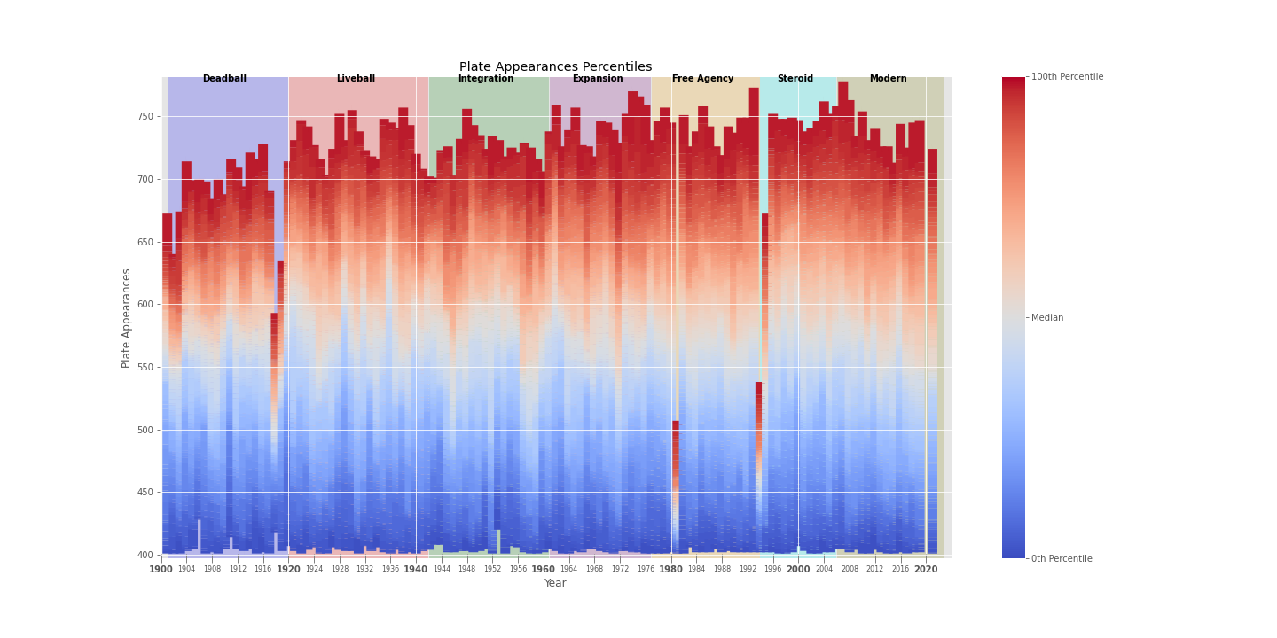
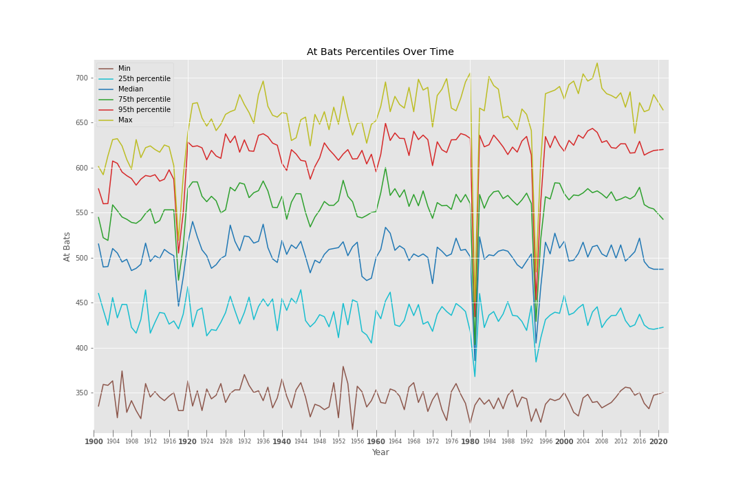
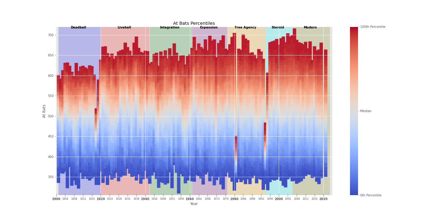
Caveat: Just to reiterate, the below analyses only consider players with >400 plate appearances in a season. Thus, take the At Bat and Plate Appearance plots with a grain of salt.
Code
Code for generating all of the plots in this post can be found at the Github repo here:
https://github.com/Miking98/mlb-dist-stats-over-time
Stat Ranges
To generate the following graphs, I calculated the 1st, 2nd,…,100th percentile value for each stat for every MLB season since 1901 (only considering MLB players with >400).
For each stat, this gave me a table where each row was a year and each column was a percentile. I then took the row corresponding to each player archetype (as defined above) and plotted a histogram of that row’s values at that percentile.
This yielded a graph containing six overlapping histograms (one for each player archetype), where the x-axis was the statistic value and the y-axis was the number of seasons when the player of that archetype achieved that value.
Hits
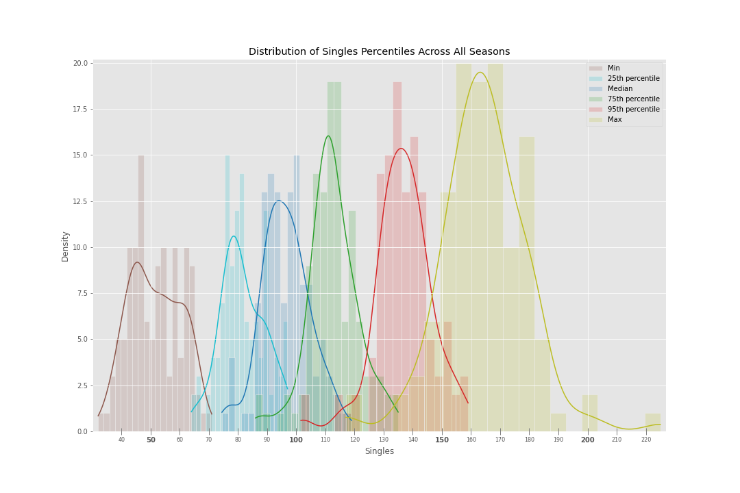
Singles
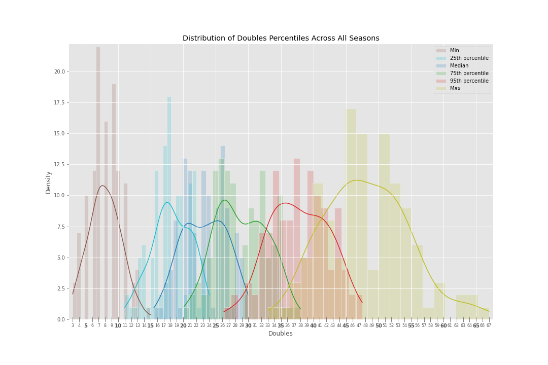
Doubles
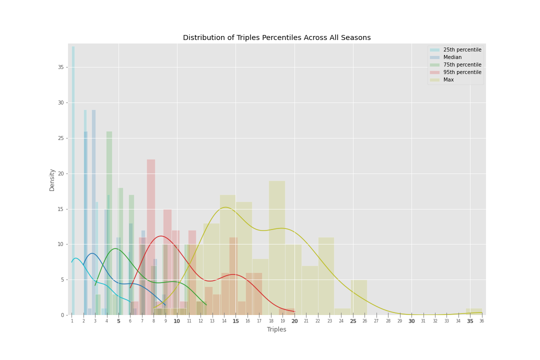
Triples
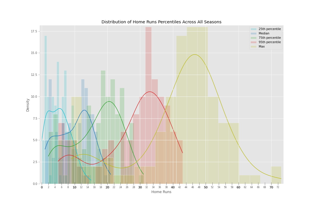
Homers
Appearances
At Bats (ABs)
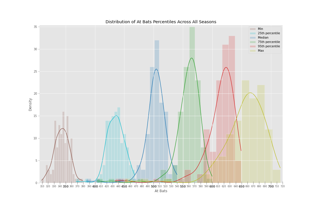
Plate Appearance (PAs)
Rate Stats
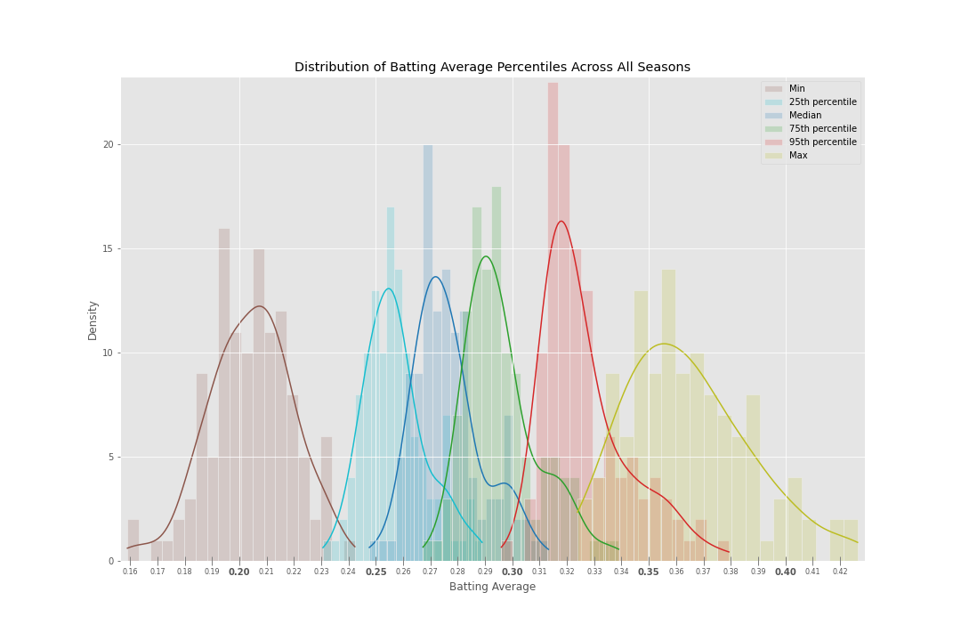
Batting Average (AVG)
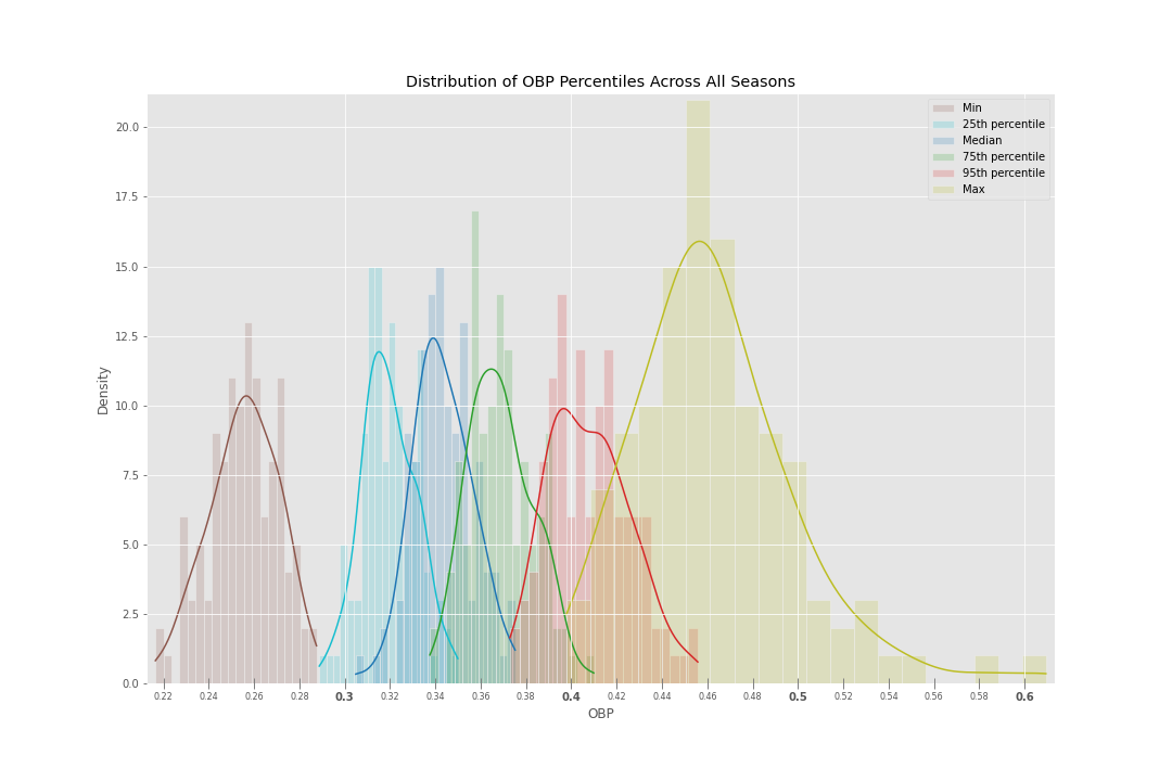
On Base Percentage (OBP)
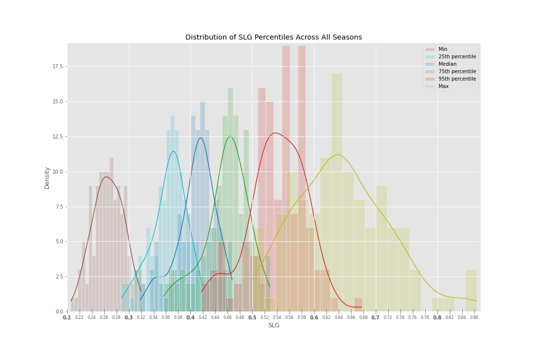
Slugging Percentage (SLG)
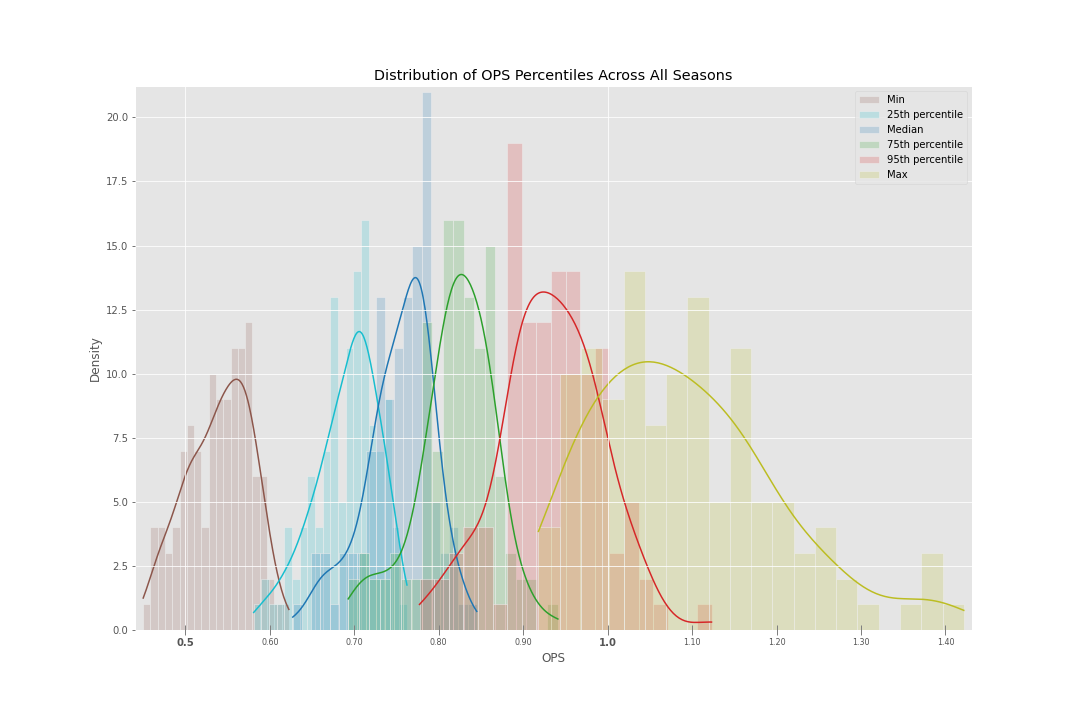
On Base Plus Slugging (OPS)
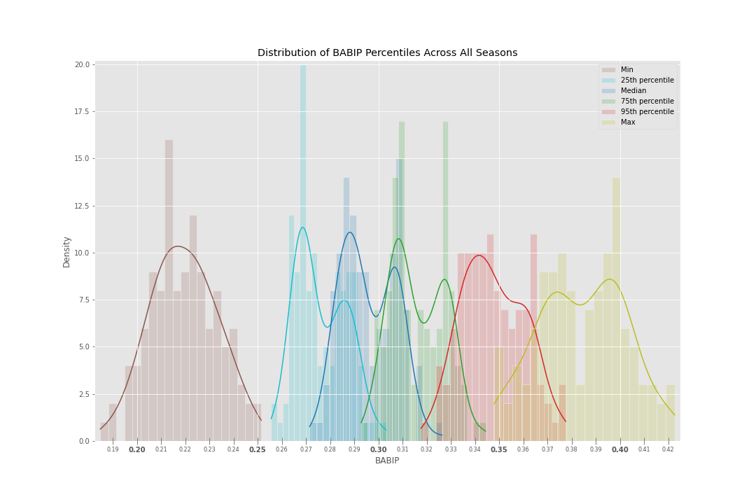
Batting Average on Balls in Play (BABIP)
Other
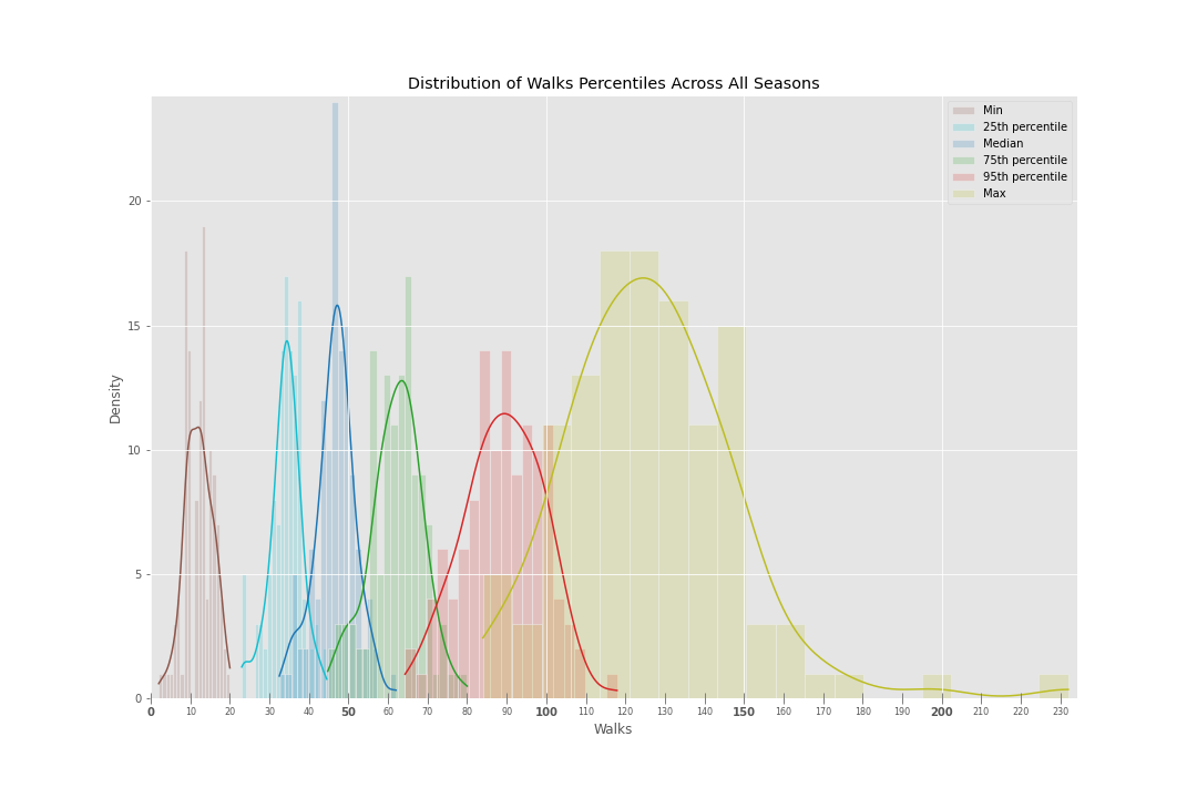
Walks (BBs)
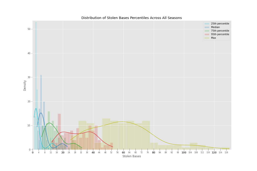
Stolen Bases (SBs)
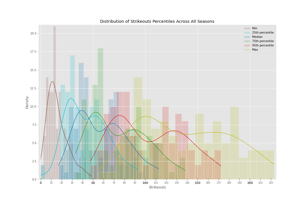
Strikeouts (SOs)
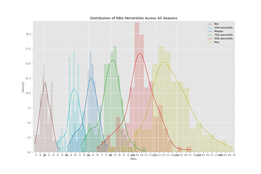
Runs Batted In (RBIs)
Trends over time
Next, I wanted to visualize how the stats we’d expect different player archetypes to achieve has changed over time.
Per this Sport Journal article, I used the following 7 major eras of MLB history:
- Dead Ball Era (1901-1919)
- Live Ball Era (1920-1941)
- Integration Era (1942-1960)
- Expansion Era (1961-1976)
- Free Agency Era (1977-1993)
- Steroid Era (1994-2005)
- Modern Era (2005-present)
For clarity, I chose to visualize this data two ways.
1) Discrete Percentiles – A time series with a separate, discrete line for each player archetype which shows each archetype’s associated statistical value per year. This plot is easy to read and interpret. 2) Continuous Percentiles – A time series where each year is represented as a continuous gradient ranging from the 0th to 100th percentile achieved that year. Specific percentiles are difficult to parse, but this plot does not arbitrarily limit the information that is displayed as the Discrete plot does.
Steady Decline
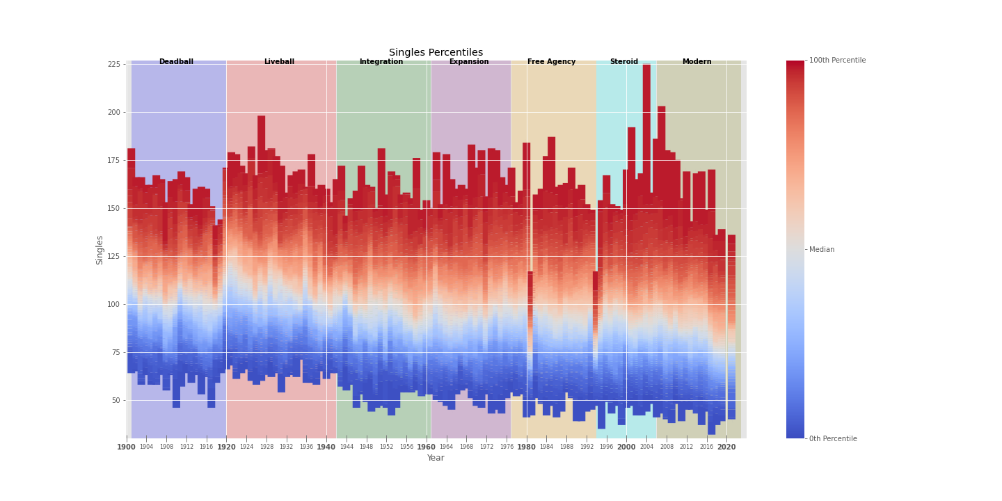
Singles
Besides the Max single totals remaining relatively consistent at ~175 (minus the Ichiro-induced spikes in the early 2000s), here we see a very slow but steady decline in singles totals across all non-Max playesr from the Liveball Era through the Modern Era.
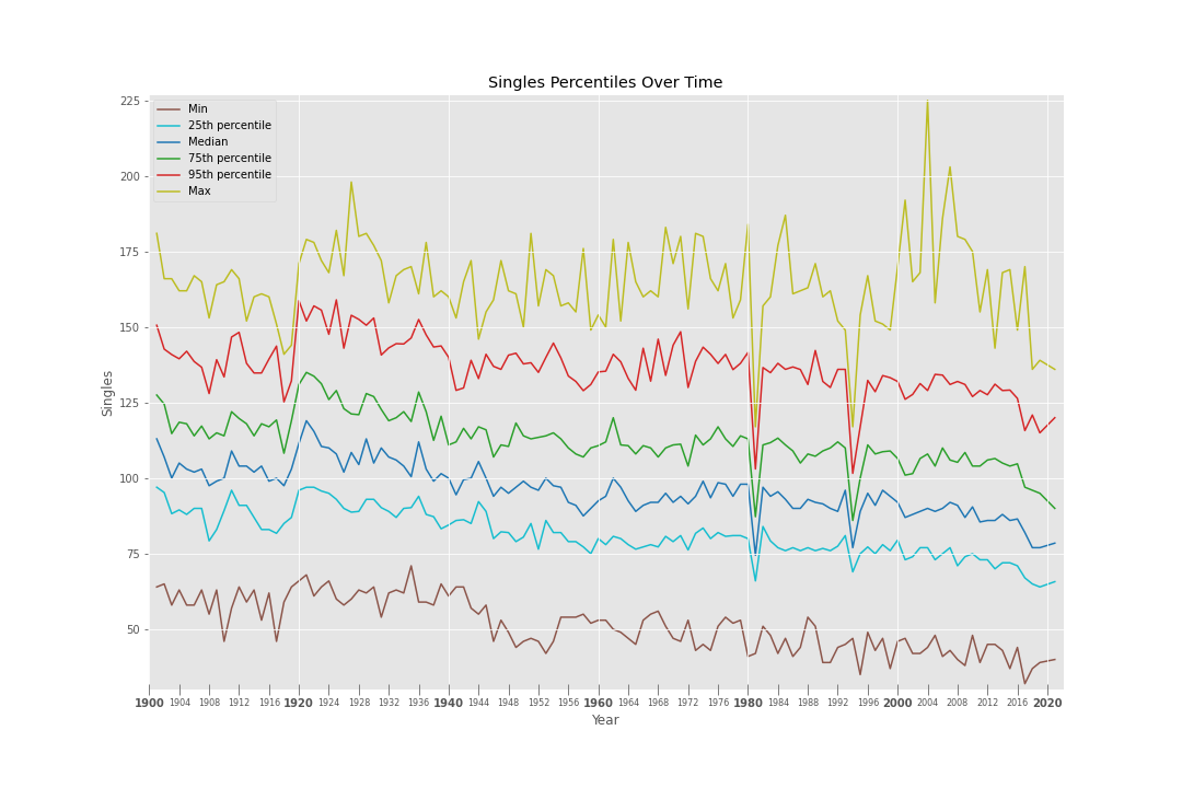
This can probably be attributed to both (i) a decline in overall batting average, (ii) an increase in power which converts singles into doubles and home runs.
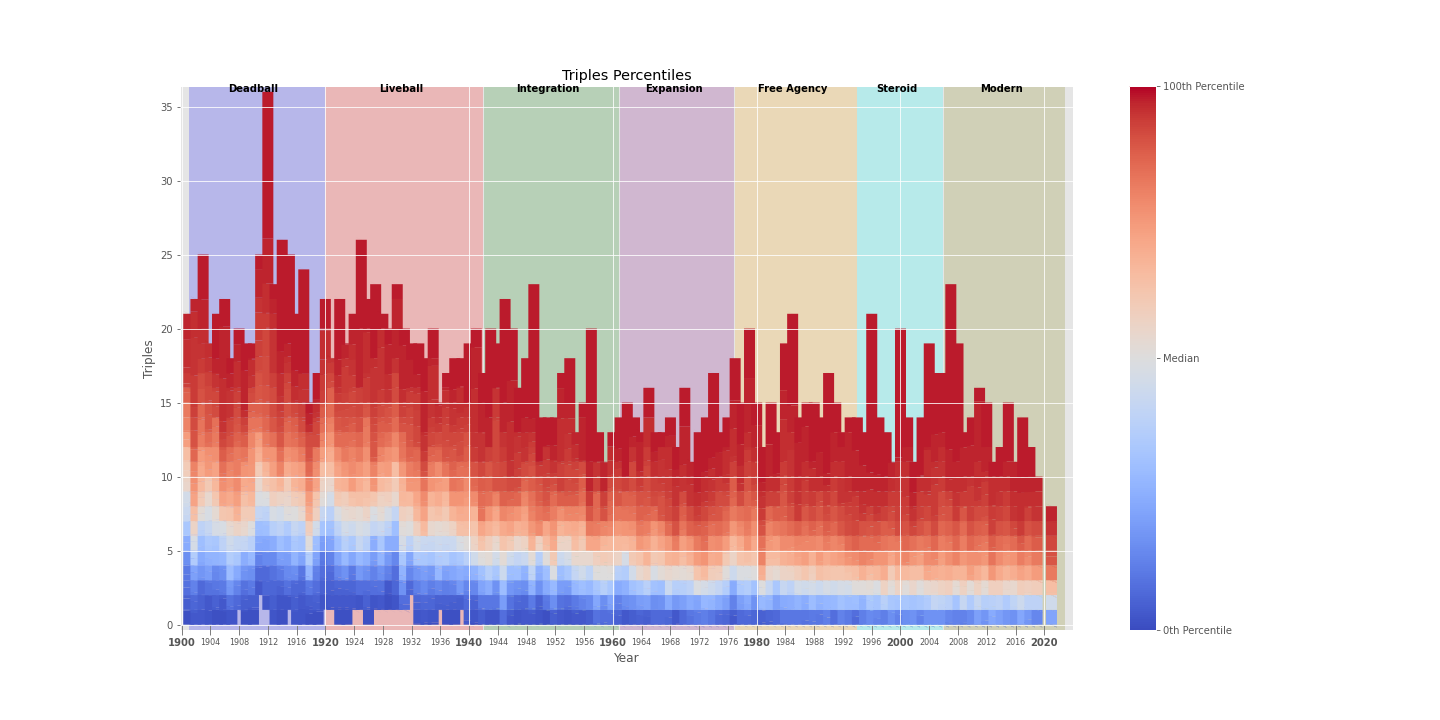
Triples
For virtually all players (except Max), triples have experienced a steady and continuous decline since the Deadball Era.
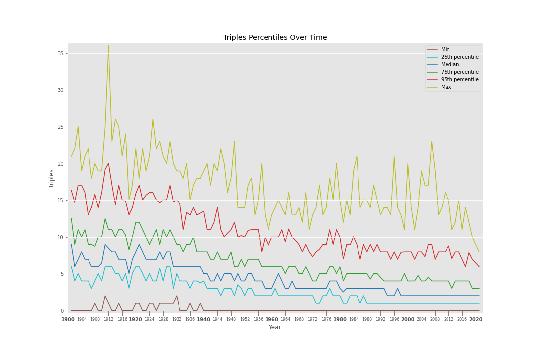
Even Elite players don’t break double digits these days, and the Max player for any given year tends to be a fairly random player (Jose Reyes, Jimmy Rollins, and Carl Crawford being the only recent exceptions).
Constants
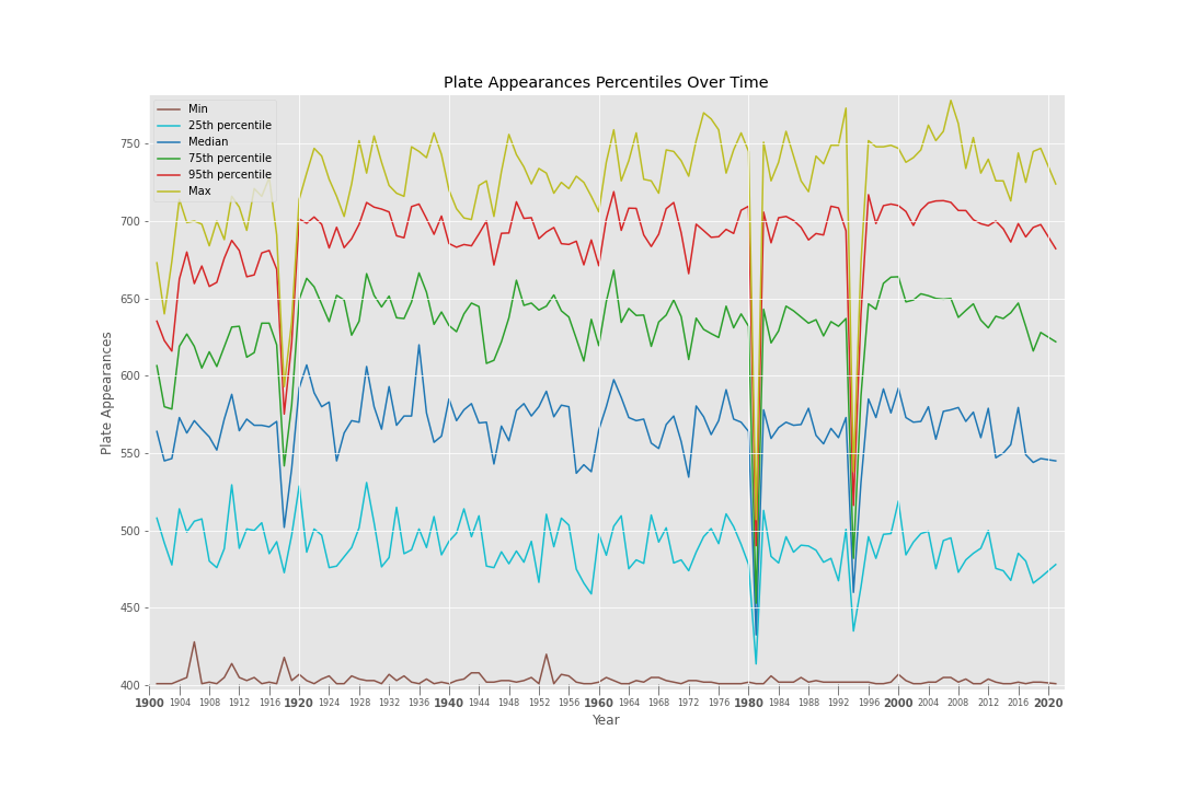
Plate Appearances
Once you adjust for schedule changes (the AL switched from a 154-game schedule to a 162-game schedule in 1961, and the NL followed suit in 1962), and shortened seasons (1918-19: WWI, 1972: strike, 1981: strike, 1990: strike, 1994-95: strike, 2020: pandemic), the number of plate appearances has remained fairly stable over time.
At Bats
Similar to plate appearances, not a ton of trends to see here.
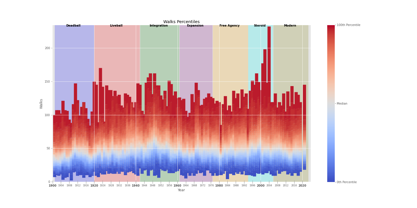
Walks
Walks are pretty consistent over time, with the Median player receiving ~50 per year, and the Elite players receiving slightly under ~100 per year.
The major anomaly is the Max in the Steroid Era, which is due to Barry Bonds racking up insane walk totals (232 in 2004, 148 in 2003, 198 in 2002, and 177 in 2001).
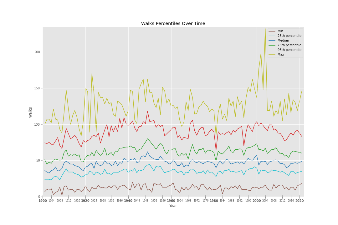
Interestingly, we don’t see a spike in walks during the Modern Era despite the MoneyBall revolution, maybe because its lessons were applied equally on both sides of the ball (e.g. batters prioritized taking walks while pitchers prioritized not giving walks).
Ups and Downs
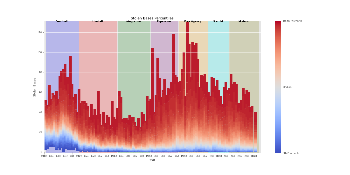
Stolen Bases
Stolen bases exhibit a bimodal distribution over the course of MLB history.
For the Median player, the heyday of stolen bases was the Deadball Era, when speed was a more essential aspect of the game and thus an asset possessed by most players out of necessity. But as power become a bigger part of the game, the Median player also began to de-emphasize stolen bases as part of his game, and has hovered around a measly ~10 SB/year since the start of the Liveball Era.
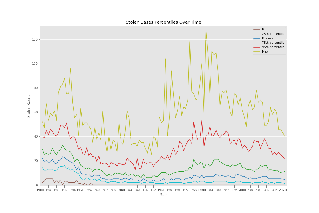
For Max, Elite, and Good stolen base players, however, their heyday was the Expansion and Free Agency eras, in which they returned (and often exceeded) their Deadball Era totals (in large part thanks to Lou Brock, Rickey Henderson, and Vince Coleman).
There are several reasons suggested for this uptick, including an overall decline in run scoring (necessitating more creative ways of pushing runners across the plate), a leaguewide shift in strategy, and the opening of larger ballparks with sprawling outfields that both required speedy outfielders to flag down fly balls and benefited players who could spray the gaps for extra bases.
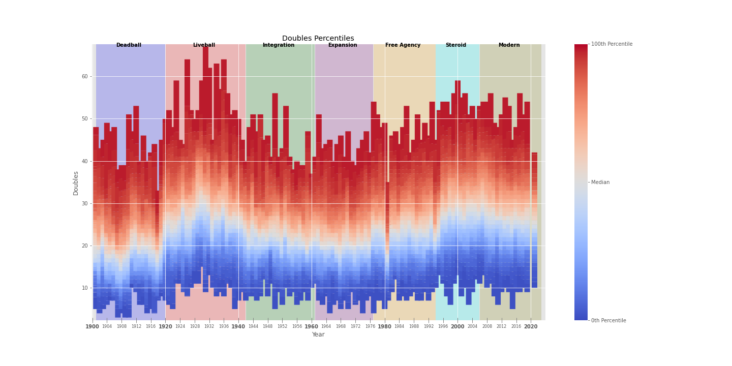
Doubles
After a bit of a lull from the 50’s through the 70’s, doubles have come roaring back into fashion. The Median player today will be expected to hit roughly 25 doubles, while great players will touch 40 of them.
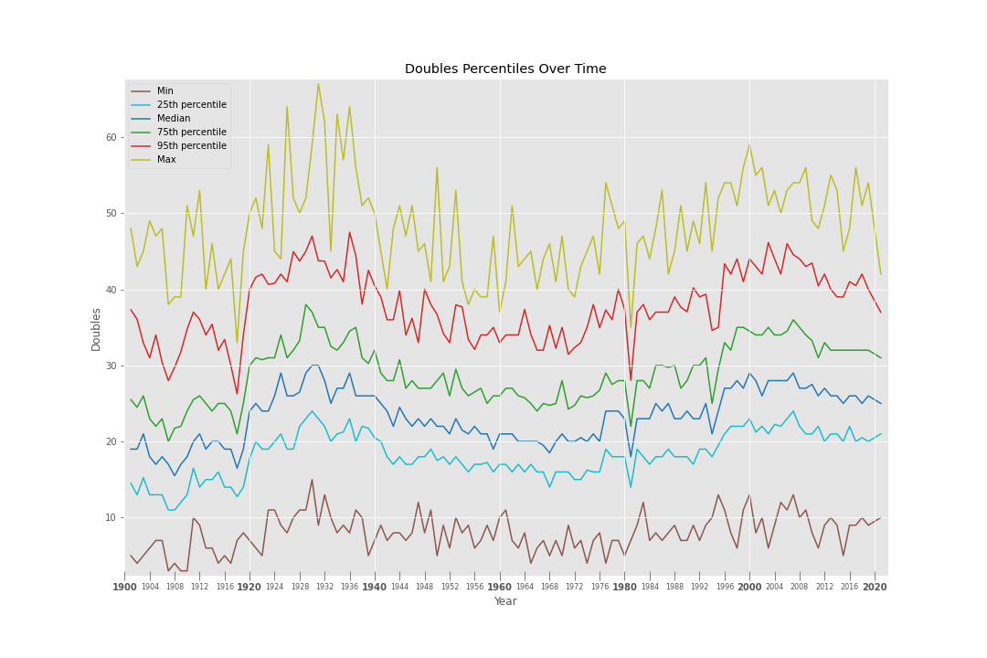
This is definitely a “rising tide lifts all boats” scenario, as we see the same consistnet eb-and-flow in doubles totals among all types of players.
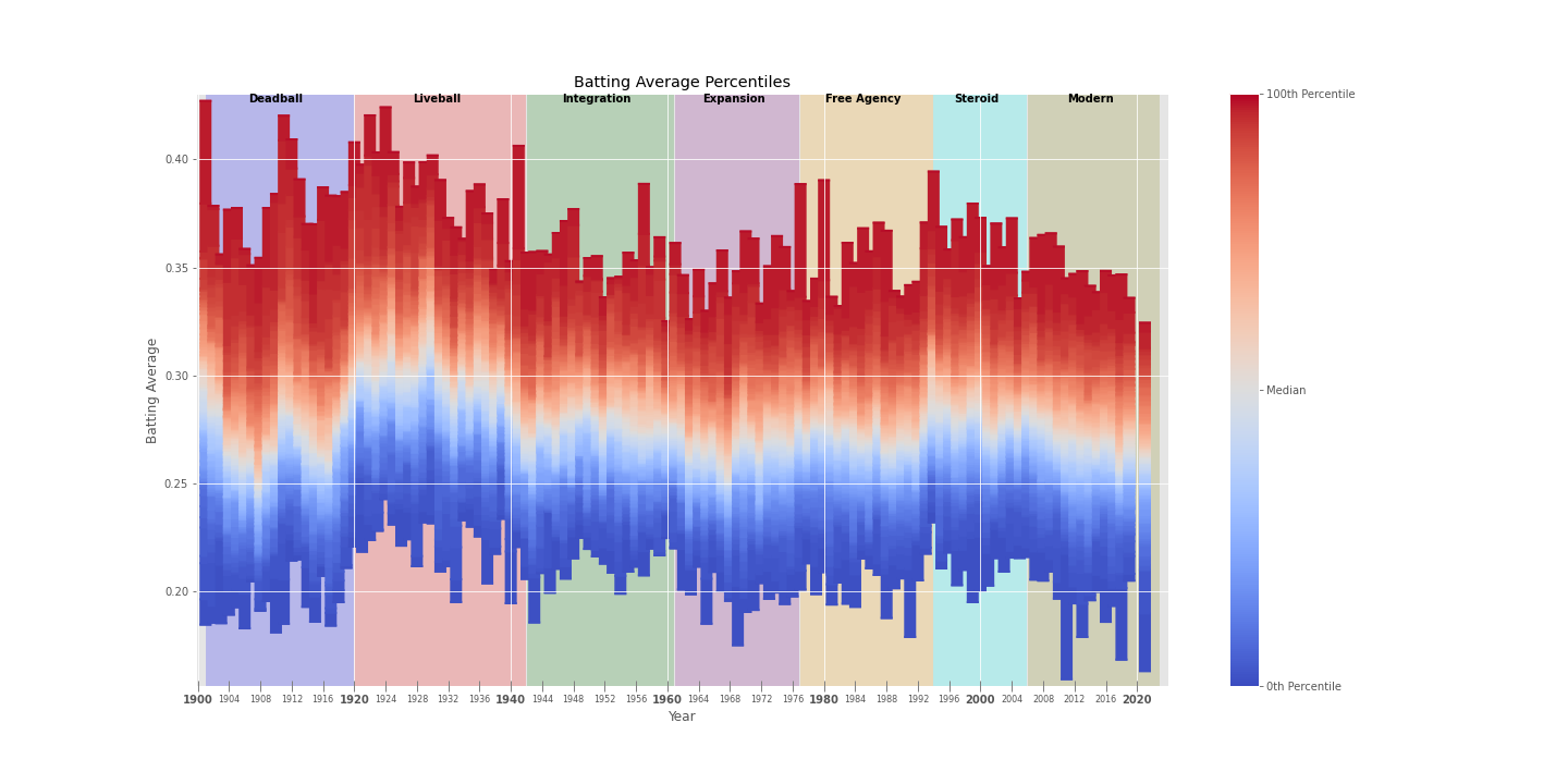
Batting Average
Batting average clearly peaked during the Liveball Era, where the Median player batted over .300 (!) for multiple seasons (higher than we’d expect Good players to hit today). In the Liveball Era, we also see Max players consistently beating .400, and Elite players hitting over .350. Heck, even Mediocre players hit at the level we’d expect the Median player to hit nowadays.
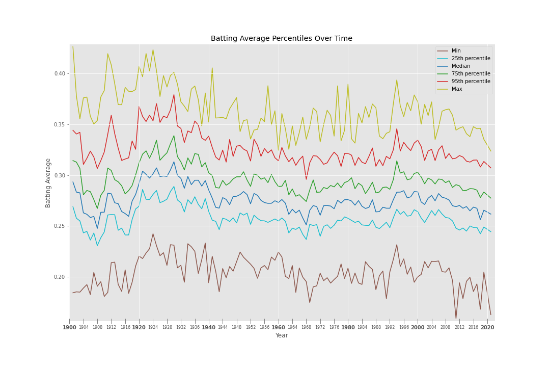
Batting averages remained fairly steady since then, bottoming out during the early 1960s during the Expansion Era before a slight uptick during the Steroid Era. During the Modern Era, however, batting averages have experienced a steady and consistent decline – the Median batter today hits ~.260 while Elite hitters are at ~.310.
Interestingly, the gap between each batter archetype has remained relatively equal over time.
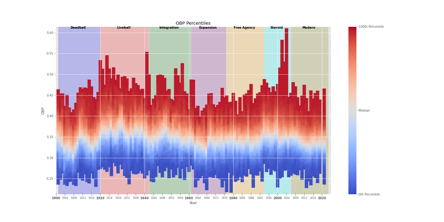
OBP
This was one of the more interesting trends, as I had expected OBP to peak sharply with the advent of sabermetrics and Moneyball in the Modern Era as hitters became more aware of the value of taking walks.
However, we actually see a steady decline in OBP since the Steroid Era across all types of hitters.
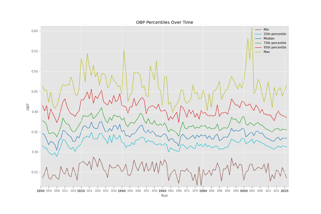
This makes sense given the two statistics that make up OBP: Hits + Walks.
Thus, its no surprise that OBP simply mirrors the sum of trends of its two component parts: it peaks just as batting average peaks in the Liveball and Steroid eras, with walks not providing much of a difference due to their relatively constant totals across eras.
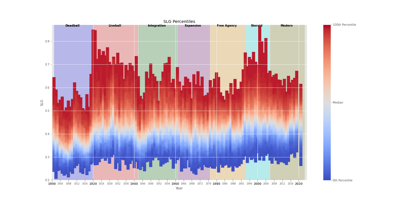
SLG
Slugging percentage seems to bounce around a fair amount as well.

I would have expected the sharp uptick in home runs over time (detailed below) to have a bigger effect on SLG, but besides the most powerful hitters seeing huge swings era-to-era, the median player appears to be relatively consistently bounded between 0.35 and 0.45.
Consistent Increase
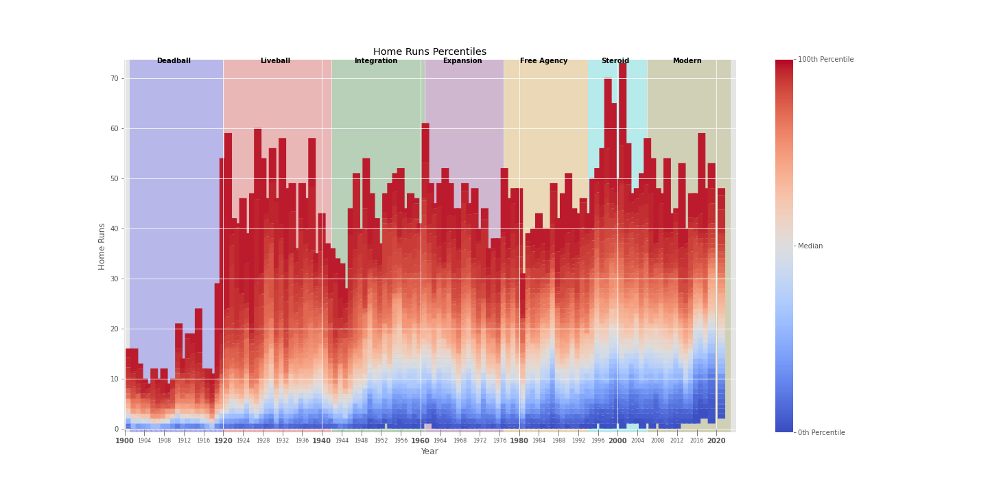
Homeruns
All hitters have steadily increased their home run totals over time since the Liveball Era, with a sharp jump during the Steroid Era (cough cough) that has largely continued (even after PED bans) thanks to a leaguwide shift in strategy which emphasizes power and fly balls over contact.
This is primarily evident from the performance of the non-Elite/Best hitters. Yes, it could be the case that these power numbers are caused by every batter in MLB taking steroids. But, if we assume that this is not the case, then the most logical explanation for the “rising tide lifting all boats” that we’re seeing (where even the Median batter is expected to hit ~20 home runs in today’s homer-happy environment) is that there are leaguewide shifts in hitting approach/pitching strategy/ballparks/ball juicing which have substantially altered the prevalence of home runs.
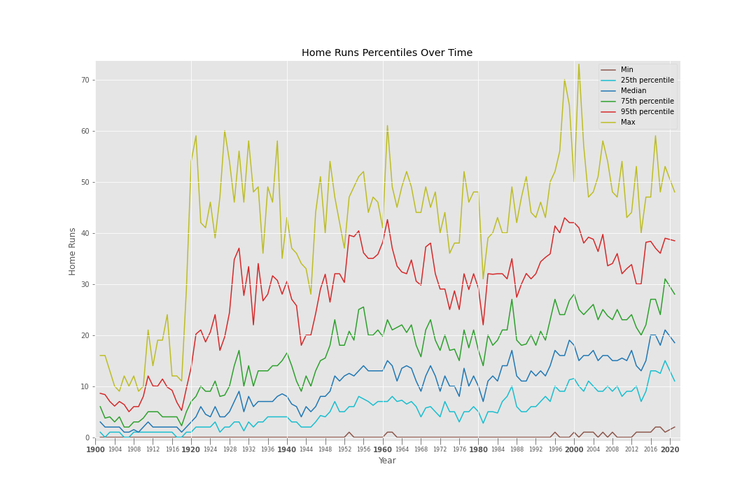
The Mediocre home run hitter in today’s game will hit double-digit home runs, which is roughly what we’d expect from a Good hitter in the Liveball Era, or a Median hitter before the Free Agency Era.
When it comes to Elite hitters, the story is much less exciting. If you ignore the Steroid Era (the huge spikes are attributable to Bonds and McGwire), then Elite/Max hitters don’t show nearly as much improvement over time as the Mediocore/Median/Good hitters. Elite hitters tend to oscillate between 30-40 home runs, while Max hitters typically clock in between 45-60 homers.
This may indicate that Elite/Max home run hitters have always been following the approach that Mediocre/Median/Good hitters are now adopting – namely, swinging for the fences – and that the returns may diminish at a certain point.
Strikeouts
Strikeouts have steadily gone up over time. We see that the Max scores have almost always gone up.
The Median player’s strikeout total shows an interesting story. After increasing steadily from the Liveball Era to the start of the Expansion Era, we see a bit of a decline/plateau in strikeouts after the rule changes that MLB put into effect following the “Year of the Pitcher” (1968), such as lowering the mound and shrinking the strike zone. Following this lull, we see a resumption in the steady climb in strikeouts that accelerates rapidly once we reach the Modern Era.
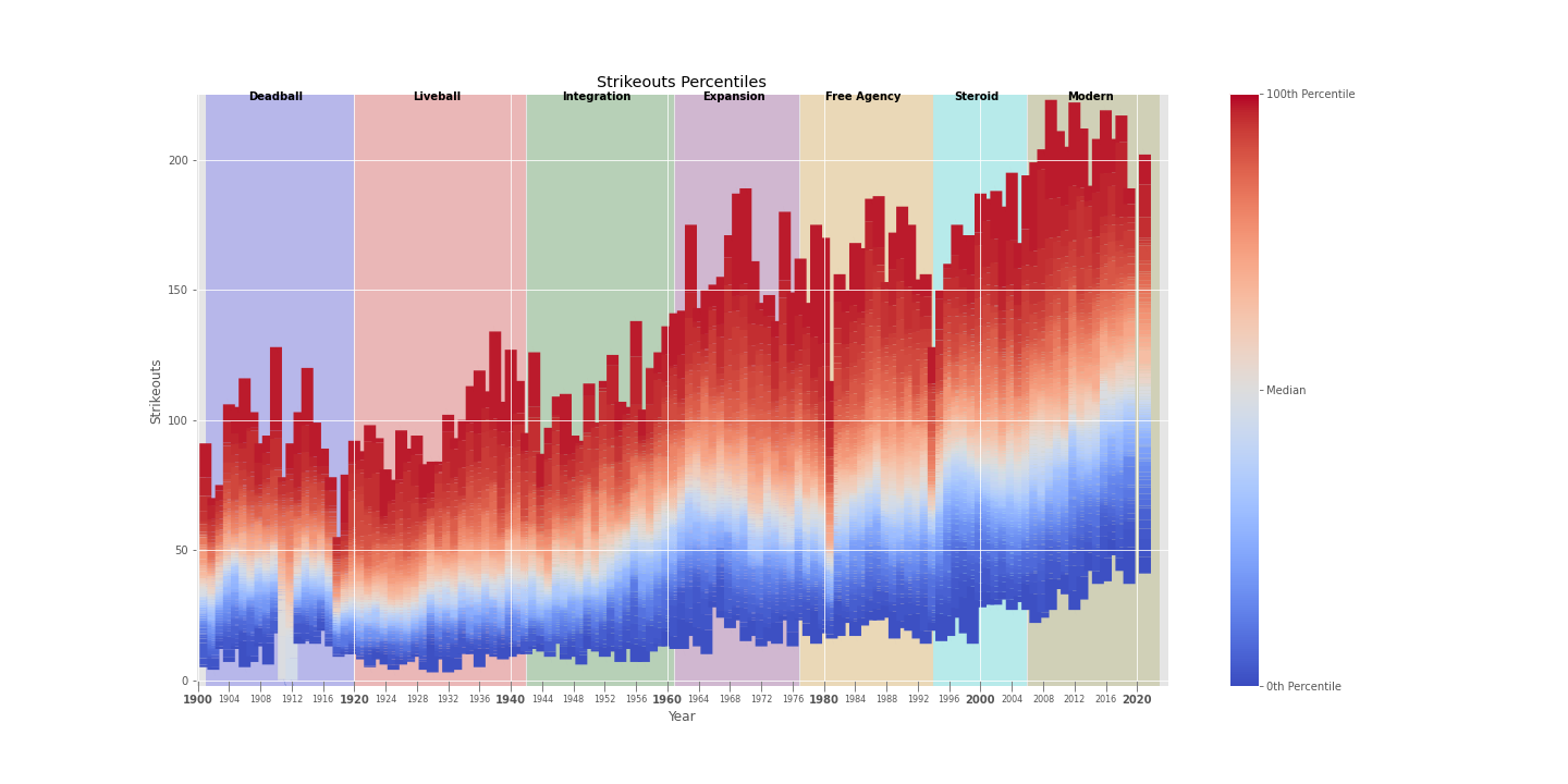
This would align well with the current sabermetrically-dirven “three true outcomes” approach to hitting, in which the cost of strikeouts is weighted less heavily than the gain from trying to hit the ball harder.
And, even in the absence of sabermetrics, the increased emphasis on home runs and power (as the above home run graphs show) indicates that MLB players have always been increasingly “swinging for the fences” as the game progressed.
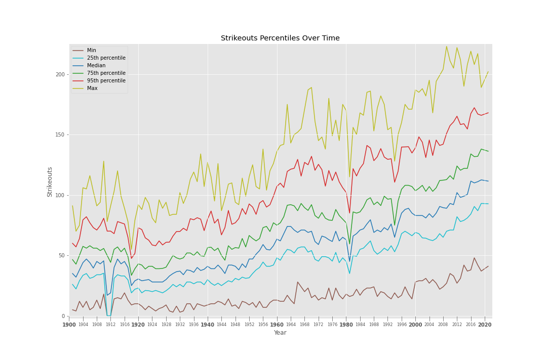
As Tom Glavine and Greg Maddux once astutely noted, “chicks dig the longball”.