Matplotlib Tips + Tricks
Lesser-known matplotlib tricks for frequent users of the Python library
These are all taken from this great 3-hr YouTube tutorial by Ben Root from SciPy 2018. I’ve condensed the main takeaways of the talk into the following list of key concepts / tricks that I hadn’t previously been aware of.
General
To set figure aspect ratio to 2:1:
fig, ax = plt.subplots(figsize=plt.figaspect(0.5))
To loop through axes without axes[0][0] notation:
fig, axes = plt.subplots(nrows=2, ncols=2)
for ax in axes.flat:
	ax.plot(x,y)
To change z-order of plot (higher value = on top):
ax.plot(x, y, zorder=1)
ax.fill_between(x, y1, y2, zorder=2)
To get aes() ggplot-like dataframe processing:
df = {
  'x' : [0],
  'y' : [1],
}
ax.plot('x', 'y', data=df)
To modify the aesthetics of any “artist” (i.e. visual element on a plot) after creation:
bars = ax.bar(x, y, color='k', align='center')
for b, y in zip(bars, y):
	if y < 0:
		bar.set(color='blue')
To plot a bunch of points with the same marker style (regardless of whether you show a line or not), use plot(). Otherwise, use scatter()
To get LaTex, use an r string with $ for math:
plt.title(r'$\sigma_i=1$')
To add/remove padding to plot:
ax.margins(x=0.1,y=0)
To get x-data to take up same number of pixels as equivalent range in y-axis:
ax.axis('equal')
To get chart element to not appear in legend, use the _nolegend_ label:
ax.plot(x, y, label="_nolegend_")
To have two plots share axes:
fig, axes = plt.subplots(1,2, sharex=True, sharey=True)
To have one plot have two different y-axis scales (“twinning”):
fig, ax1 = plt.subplots()
ax2 = ax1.twinx()
ax1.plot(x,y)
ax2.plot(x2,y2)
Artists
An artist is anything that is visible on the plot.
There are two types of artists:
- Primitives – Shapes
- e.g. Rectangle, Polygon, Circle, Line
- Containers – They are given a list of primitives to draw
- e.g. Figure, Axes, Collection
To get a list of properties for an artist $X$:
plt.getp(X)
Limits
Always set limits after you plot your data
Ticks
- Tick (
ticks) = location of tick label - Tick Line (
ticklines) = line that denotes location of the Tick - Tick Label (
ticklabels) = text dislabed at Tick - Ticker = automatically determines Ticks + formats Tick Labels
Colors
Colormaps
Colorbars must be added to fig, not ax b/c it will occur outside of the ax and “steal” room from it. By default, it steals space from the last ax
im = ax.imshow(data)
fig.colorbar(im)
To use bottom-left to be origin of image (rather than top-left):
im = ax.imshow(data, origin='lower')
fig.colorbar(im)
To get to be centered at 0 (i.e. map white to 0 for the red/blue seismic colormap), use vim, vmax to specify the range of the colormap
X = Some constant
im = ax.imshow(data, cmap='seismic', vmin=-X, vmax=X)
To get an array from a colormap:
from matplotlib import cm

# To get 'Blues' divided into 10 equally spaced shades, using full spectrum
colors = cm.get_cmap('Blues', 10)(np.linspace(0, 1, 10))
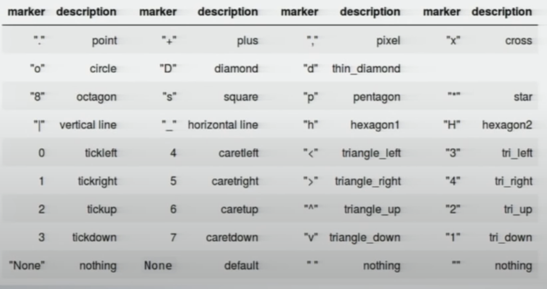
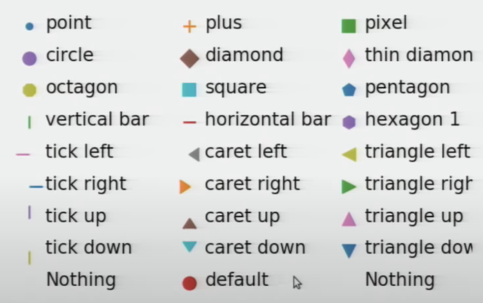
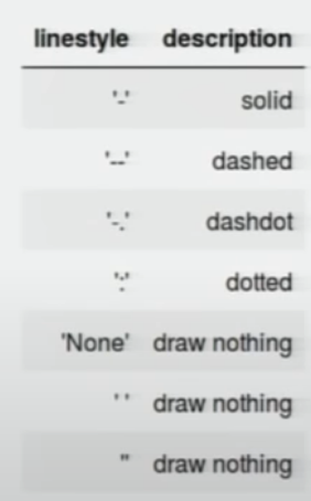
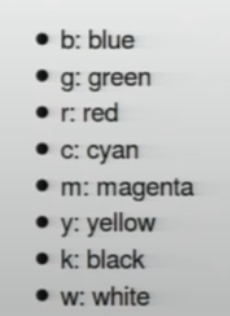
Markers + Lines