AI Tool Review - Microsoft LIDA for data exploration
LIDA is a new Python library for automatically generating data visualizations using large language models (LLMs) like ChatGPT.
In this post, I’ll show you how to install LIDA and use it for your own dataset.
I’ll walk through my own usage of the tool, and conclude with my thoughts on its current strengths / limitations.
Setup
To install:
pip install lida
To run:
export OPENAI_API_KEY=<Your OpenAI API Key>
lida ui --port=8080
Then go to localhost:8080/demo/ in your browser.
You should see this:
Note: I tried to directly use LIDA’s Python API in a Jupyter notebook, but kept running into documentation issues (e.g. the code in the Github repo was not aligned with the pip package). I would recommend using the web UI, as it is faster to use out-of-the-box and works as expected.
Case Study: LIDA for Chess Ratings
I previously wrote a post about the correlation between chess players’ standard, blitz, and rapid ratings.
I was curious how much faster I could have done this data analysis if I had used LIDA.
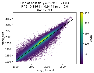
Specifically, I wanted to create a scatter plot showing the correlation between a player’s FIDE standard rating v. blitz rating that looked something like this:
First, I redownloaded the dataset of the FIDE ratings for all chess players across standard, blitz, and rapid chess in 2021. You can find this dataset on Kaggle here.
Specifically, we’ll be looking at ratings_2021.csv. A few random rows from the CSV are below:
| fide_id | year | month | rating_standard | rating_rapid | rating_blitz |
|---|---|---|---|---|---|
| 100013 | 2021 | 1 | 2420.0 | 2374.0 | 2378.0 |
| 100021 | 2021 | 1 | 2422.0 | ||
| 100137 | 2021 | 1 | 2514.0 | 2448.0 | 2467.0 |
| 100145 | 2021 | 1 | 1879.0 | ||
| 100153 | 2021 | 1 | 2438.0 | 2440.0 | |
| 100170 | 2021 | 1 | 1930.0 | ||
| 100188 | 2021 | 1 | 2435.0 | 2462.0 | |
| 100196 | 2021 | 1 | 2391.0 | 2414.0 | 2340.0 |
| 100200 | 2021 | 1 | 2380.0 | 2352.0 | 2395.0 |
| 100218 | 2021 | 1 | 2419.0 | 2458.0 | 2394.0 |
| 100234 | 2021 | 1 | 2410.0 | 2376.0 | 2398.0 |
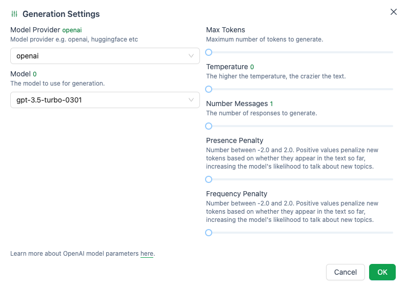
First, I started my LIDA server and checked that my Generation Settings were set to the default:
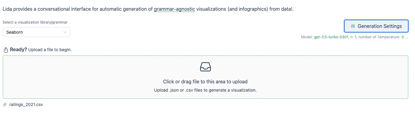
Next, I uploaded the ratings2021.csv file to LIDA.
Immediately, LIDA gives me a nice Data Summary containing summary stats for each column.
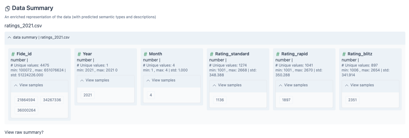
Note that LIDA recommends only using CSVs with <=10 columns. Thankfully, we are within this recommended range, although I haven’t tested larger datasets.
Next, LIDA generates a set of Goals based on the above Data Summary. Each panel is a specific question, with the type of plot that might answer the question in green and a more detailed explanation in grey
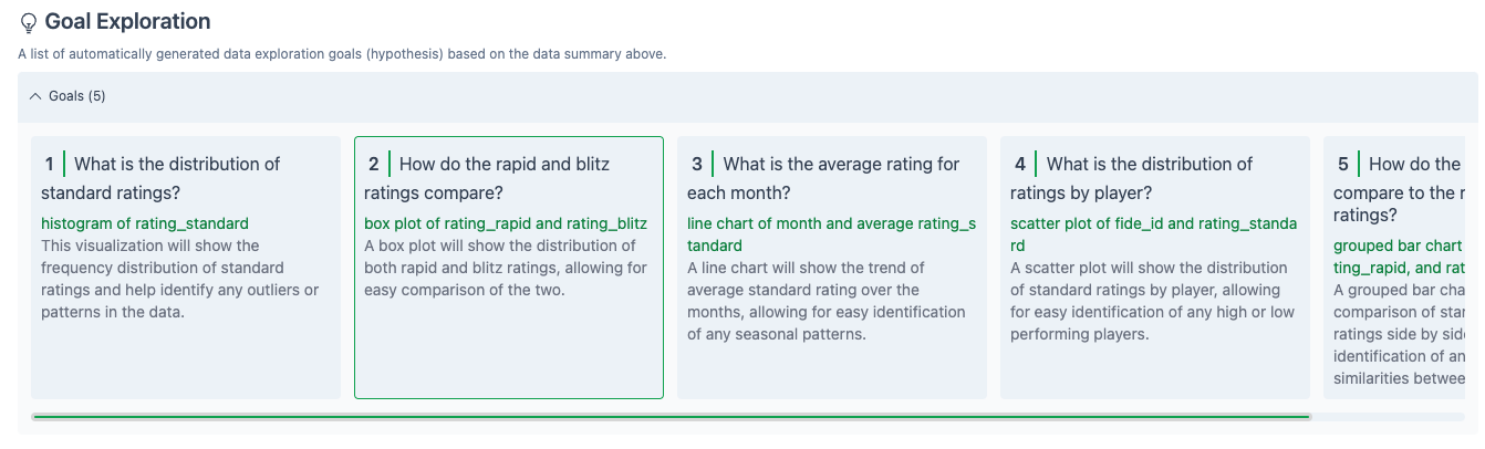
I selected Box 2, “How do the rapid and blitz ratings compare?”
LIDA immediately copies this question in to the Visualization Generation section, then generates Python code (based on the matplotlib and pandas libraries) to generate a box plot to answer this question.
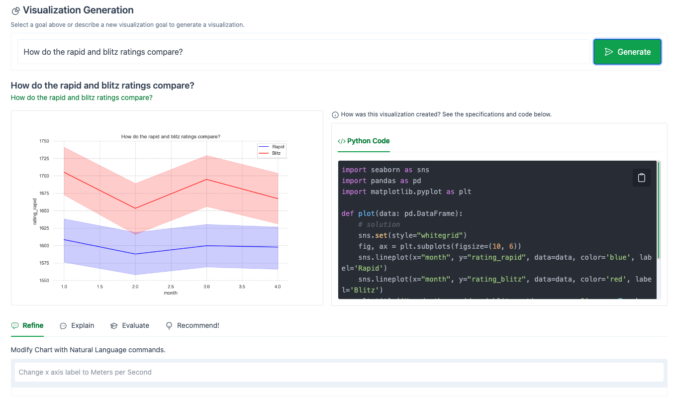
The full code that LIDA generated to create this plot is shown in the right-hand panel. This is a great feature, as it allows for easy debugging, transparency, and the ability to copy the code directly into your own notebook.
I’ve copied the code LIDA generated below:
import seaborn as sns
import pandas as pd
import matplotlib.pyplot as plt

def plot(data: pd.DataFrame):
    # solution
    sns.set(style="whitegrid")
    fig, ax = plt.subplots(figsize=(10, 6))
    sns.lineplot(x="month", y="rating_rapid", data=data, color='blue', label='Rapid')
    sns.lineplot(x="month", y="rating_blitz", data=data, color='red', label='Blitz')
    plt.title('How do the rapid and blitz ratings compare?', wrap=True)
    plt.legend()
    return plt;

chart = plot(data)
As you can see, LIDA didn’t quite do what we had hoped.
Ideally, it would have generated a scatter plot comparing the blitz and rapid ratings for individual players.
Instead, it showed the change in average rating over time for each style of chess.
Thankfully, LIDA provides an easy way to steer the language model towards what we want, and that brings me to the coolest part of LIDA: the Refine functionality.
The Refine chat box allows you to interact with LIDA via a chat interface to modify your generated graph.
Let’s tell LIDA what we really want:
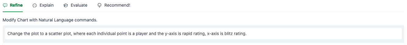
And hit the Generate button.
The result:
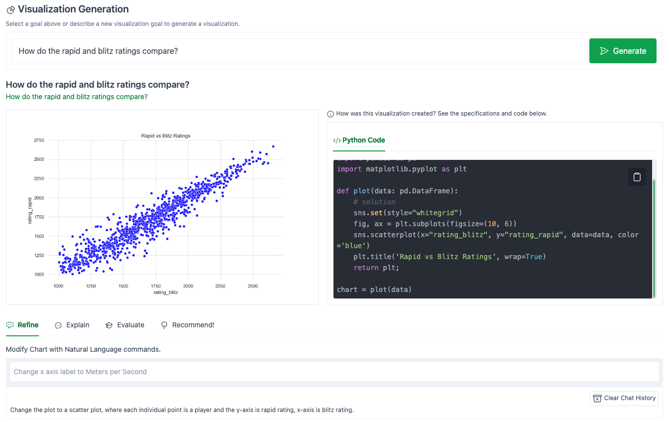
Much better!
And here is the corresponding Python code that LIDA generated in the right-hand panel:
import seaborn as sns
import pandas as pd
import matplotlib.pyplot as plt

def plot(data: pd.DataFrame):
    # solution
    sns.set(style="whitegrid")
    fig, ax = plt.subplots(figsize=(10, 6))
    sns.scatterplot(x="rating_blitz", y="rating_rapid", data=data, color='blue')
    plt.title('Rapid vs Blitz Ratings', wrap=True)
    return plt;

chart = plot(data)
Let’s see if we can get LIDA to clean up this plot, and add some nice features for us.

The result:
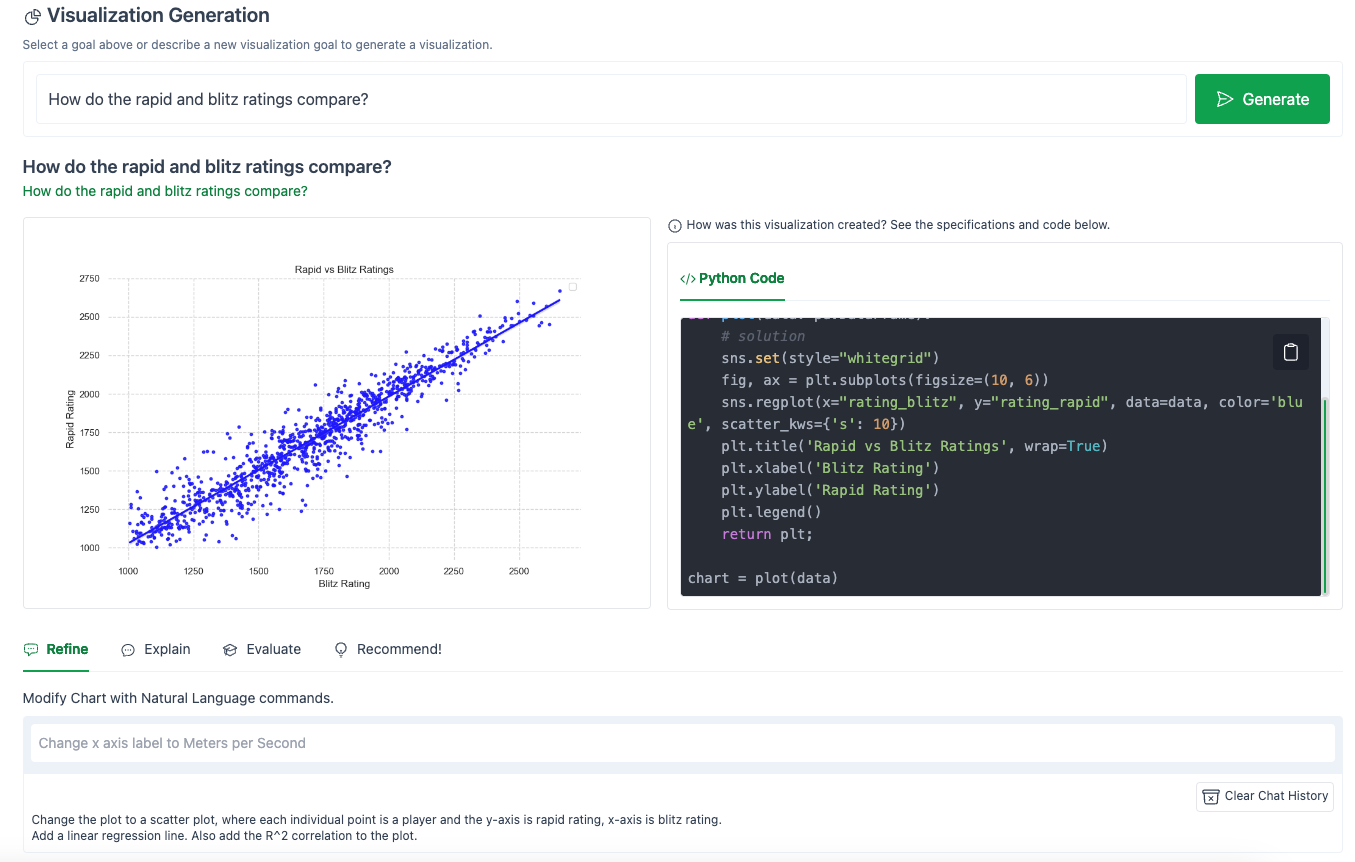
Hmm…close but not quite.
LIDA did add a linear regression (notice the call to sns.regplot()). Also, it randomly cleaned up the x-axis and y-axis labels (changing them from the column names “rating_blitz” to the more friendly “Blitz Rating”).
However, LIDA failed to add the R^2 correlation to the plot.
Let’s try again:
Hmm..that seems to have messed everything up.
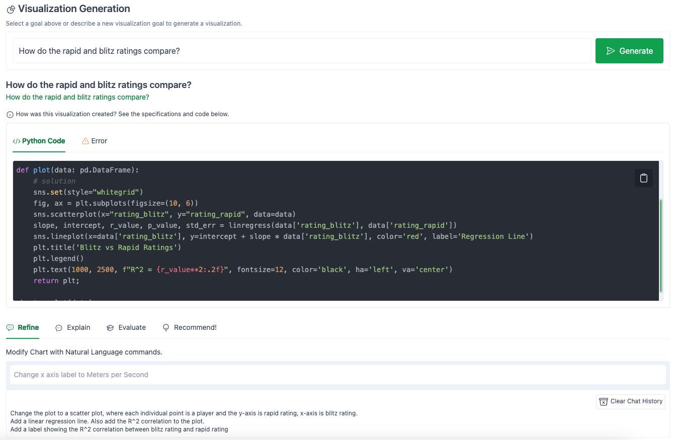
If you don’t see an image, that means that LIDA experienced an error when running the code it generated.
I’ve copied the code that LIDA generated below:
import seaborn as sns
import pandas as pd
import matplotlib.pyplot as plt
from scipy.stats import linregress

def plot(data: pd.DataFrame):
    # solution
    sns.set(style="whitegrid")
    fig, ax = plt.subplots(figsize=(10, 6))
    sns.scatterplot(x="rating_blitz", y="rating_rapid", data=data)
    slope, intercept, r_value, p_value, std_err = linregress(data['rating_blitz'], data['rating_rapid'])
    sns.lineplot(x=data['rating_blitz'], y=intercept + slope * data['rating_blitz'], color='red', label='Regression Line')
    plt.title('Blitz vs Rapid Ratings')
    plt.legend()
    plt.text(1000, 2500, f"R^2 = {r_value**2:.2f}", fontsize=12, color='black', ha='left', va='center')
    return plt;

chart = plot(data)
Can you spot the error?
A faster way to see what happened is to click on the Error panel.
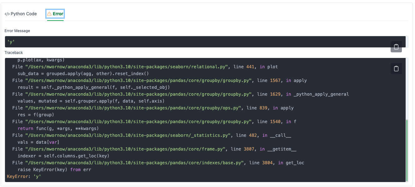
How can we fix this?
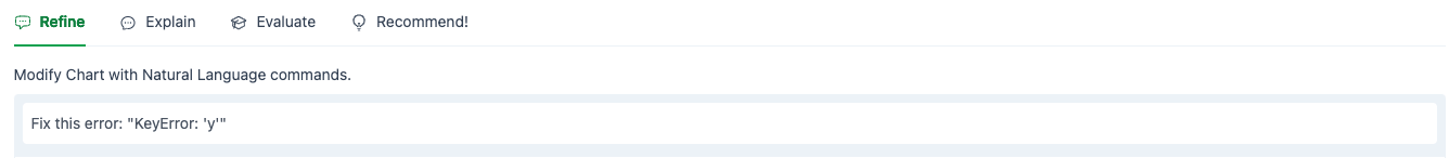
Simply copy the error into the Refine chat box, and ask LIDA to fix the error.
The result:
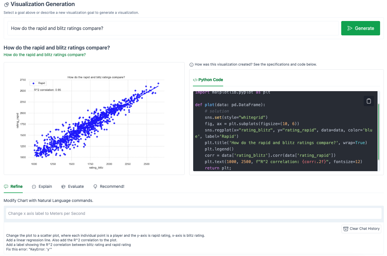
Here is the new code:
import seaborn as sns
import pandas as pd
import matplotlib.pyplot as plt

def plot(data: pd.DataFrame):
    # solution
    sns.set(style="whitegrid")
    fig, ax = plt.subplots(figsize=(10, 6))
    sns.regplot(x="rating_blitz", y="rating_rapid", data=data, color='blue', label='Rapid')
    plt.title('How do the rapid and blitz ratings compare?', wrap=True)
    plt.legend()
    corr = data['rating_blitz'].corr(data['rating_rapid'])
    plt.text(1000, 2500, f"R^2 correlation: {corr:.2f}", fontsize=12)
    return plt;

chart = plot(data)
Our error was fixed!
However, the code is also very different.
That is one thing I noticed with using GPT-3.5-Turbo as the LLM backend for LIDA – even with temperature = 0, the code can change a lot with each additional refinement you add, even if you are only asking for small changes.
Additionally, note that the R^2 calculation is incorrect.
The line:
plt.text(1000, 2500, f"R^2 correlation: {corr:.2f}", fontsize=12)
should actually be:
plt.text(1000, 2500, f"R^2 correlation: {corr**2:.2f}", fontsize=12)
After a few more refinement prompts, here is the final version of my graph:
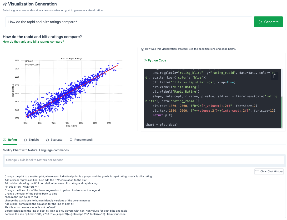
That’s pretty close! Copying the code generated by LIDA into a notebook and modifying things from there would definitely have saved time from writing this from scratch.
Here is the final code generated by LIDA:
import seaborn as sns
import pandas as pd
import matplotlib.pyplot as plt
from scipy.stats import linregress

def plot(data: pd.DataFrame):
    # solution
    data = data[pd.notna(data['rating_rapid']) & pd.notna(data['rating_blitz'])]
    sns.set(style="whitegrid")
    fig, ax = plt.subplots(figsize=(10, 6))
    sns.regplot(x="rating_blitz", y="rating_rapid", data=data, color='red', scatter_kws={'color': 'blue'})
    plt.title('Blitz vs Rapid Ratings', wrap=True)
    plt.xlabel('Blitz Rating')
    plt.ylabel('Rapid Rating')
    slope, intercept, r_value, p_value, std_err = linregress(data['rating_blitz'], data['rating_rapid'])
    plt.text(1000, 2700, f"R^2={r_value**2:.2f}", fontsize=12)
    plt.text(1000, 2600, f"y={slope:.2f}x+{intercept:.2f}", fontsize=12)
    return plt;

chart = plot(data)
And my full chat history (sorted from oldest -> most recent query):
Change the plot to a scatter plot, where each individual point is a player and the y-axis is rapid rating, x-axis is blitz rating.
Add a linear regression line. Also add the R^2 correlation to the plot.
Add a label showing the R^2 correlation between blitz rating and rapid rating
Fix this error: “KeyError: ‘y’”
Change the line color of the linear regression to yellow. And remove the legend.
Change the color of the points back to blue
change the line color to red
change the axis labels to human friendly versions of the column names
Add a label containing the equation for the line of best fit
Fix this error: ‘name ‘slope’ is not defined’
Before calculating the line of best fit, limit to only players with non-Nan values for both blitz and rapid
Remove the line
plt.text(1000, 2700, f"y={slope:.2f}x+{intercept:.2f}", fontsize=12)from your code
Finally, let’s ask LIDA to automatically generate other interesting charts using the Recommendations feature.
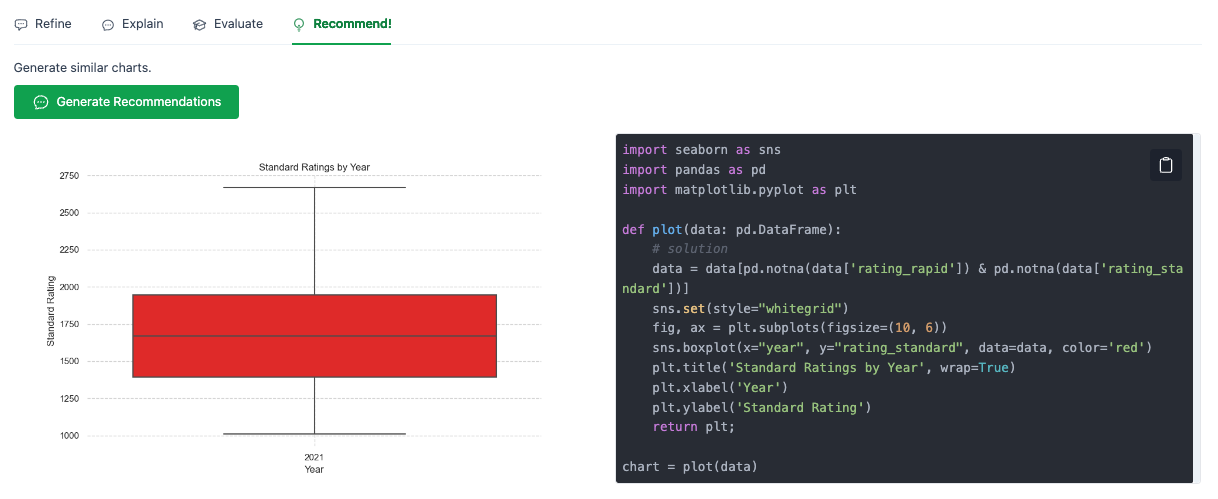
Sometimes it will generate multiple recommended charts, but this time it could only come up with a single variation on our plot.
Honestly, this is pretty underwhelming.
Next, I tried one of the other suggested questions from our original Goals panel, “What is the distribution of ratings by player?”
Here is my best result after some fiddling:
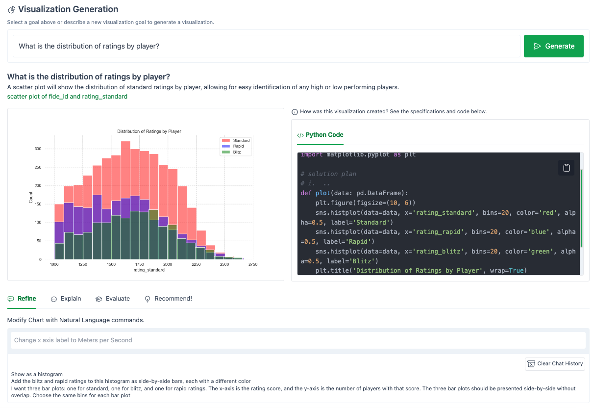
Overall, this experiment cost $0.10 in OpenAI credits (using GPT-3.5-Turbo).
Takeaways
Strengths
- Chat interface. Doing data analysis via the Refine chat interface is an awesome way of doing data exploration. Being able to copy and paste errors into LIDA, and having it fix itself, is also amazing. This dramatically improves the speed at which you can iterate.
- Web UI. The immediate visual feedback shown in the web UI makes iterating super easy.
- Transparency. Showing the actual code that LIDA generates to create a plot allows this tool to easily integrate into existing workflows. I envision LIDA doing the heavy lifting that gets you 80% of the way there, then letting you copy and modify the code yourself for that last 20%.
Limitations
- Precise editing is hard. The actual code that LIDA generates can change a lot with each Refine prompt, i.e. unlike a human who would only add the single line needed to add a specific element to a plot, LIDA will rewrite the entire function from scratch. This makes it difficult to make precise edits to a plot.
- Single CSV. LIDA only accepts a single CSV file currently, so any analysis that requires joins or comparisons between multiple datasets will require you to do that preprocessing/joining yourself.
- Bottlenecked by data summaries. LIDA generates plots based on summary statistics of each column (e.g. unique values, min/max, data type). In future versions, it would be great if you could specify additional metadata (e.g. textual descriptions) for each column, or provide additional context for LIDA to make more informed hypotheses about your data.
- Simplistic automated hypotheses. The automated recommendations / questions that LIDA generates are fairly simplistic / templated, e.g. mostly involve just comparing the distribution of two columns. More fully leveraging the latent world knowledge / processing capabilities of LLMs by providing LIDA with additional domain knowledge in its prompts (e.g. through retrieval on a domain specific corpus, or domain-specific few-shot examples, or the contents of previous example reports) could enable it to provide more insightful automated hypotheses
- History / version control. One nice feature to add would be the ability to click each prompt you submit to Refine, and then it can pull up the code / plot from that step in your workflow. You could then visualize the end result as a DAG where each node is a plot, and each transition is a refinement prompt. And you could “Undo” a bad prompt if it screwed up your plot.
References
- LIDA Github repo: https://github.com/microsoft/lida